RTÉ is Ireland’s Public Service Media Organisation and I work as Product Design Lead on the Design and UX team. Since I joined RTÉ in 2016, I have led the design of its website, rte.ie. It is one of the most-visited websites in Ireland after social media platforms. RTÉ’s editorial teams publish and highlight a variety of written, video and audio content to the public through rte.ie, focusing on national News and Sport coverage, Entertainment, Lifestyle, Culture and more.
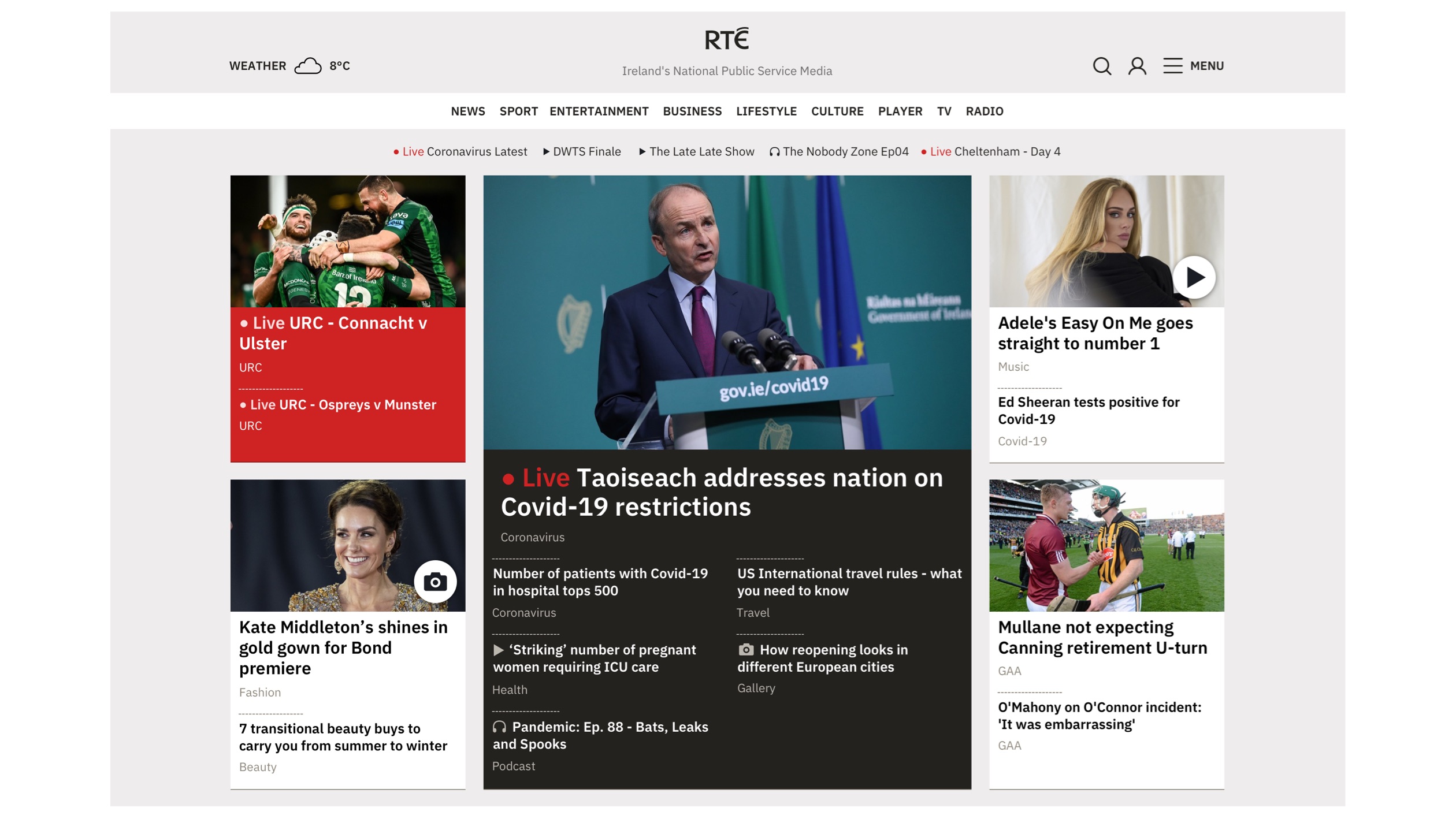
This case study covers the responsive design system I created for rte.ie and shows how the components, panels and page templates work together to display editorial content to the users. The designs below show the most recent visual design update (2021).
Jump to…
This case-study is quite long so you can use the links below to skip ahead if you like.
Project Overview
Design System
Story Tiles
Navigation
Home Page
Index Pages
Panels with Specific Uses
Story Pages
Story Page Variants
Sport Results
Events on rte.ie
Project Overview
The project team [product owner, project manager, design, development and sometimes members of editorial teams] run periodic workshops where we agree on a roadmap of new features based on user and editorial feedback. A project design document sets out the brief, scope, goals, user journeys and other relevant information. I usually draw some ideas for layouts and flows on paper and then use these as the basis for wireframes in Sketch.
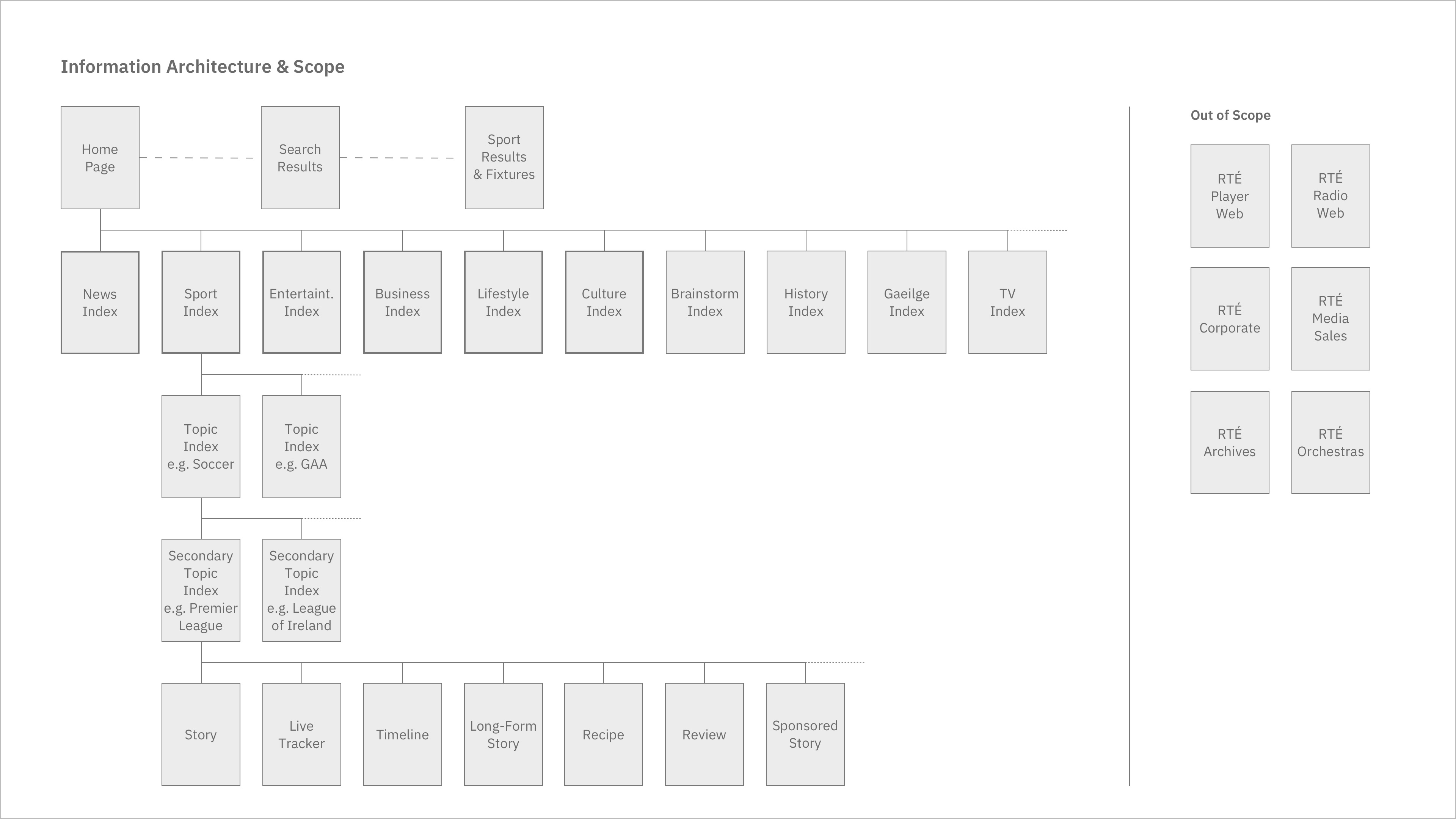
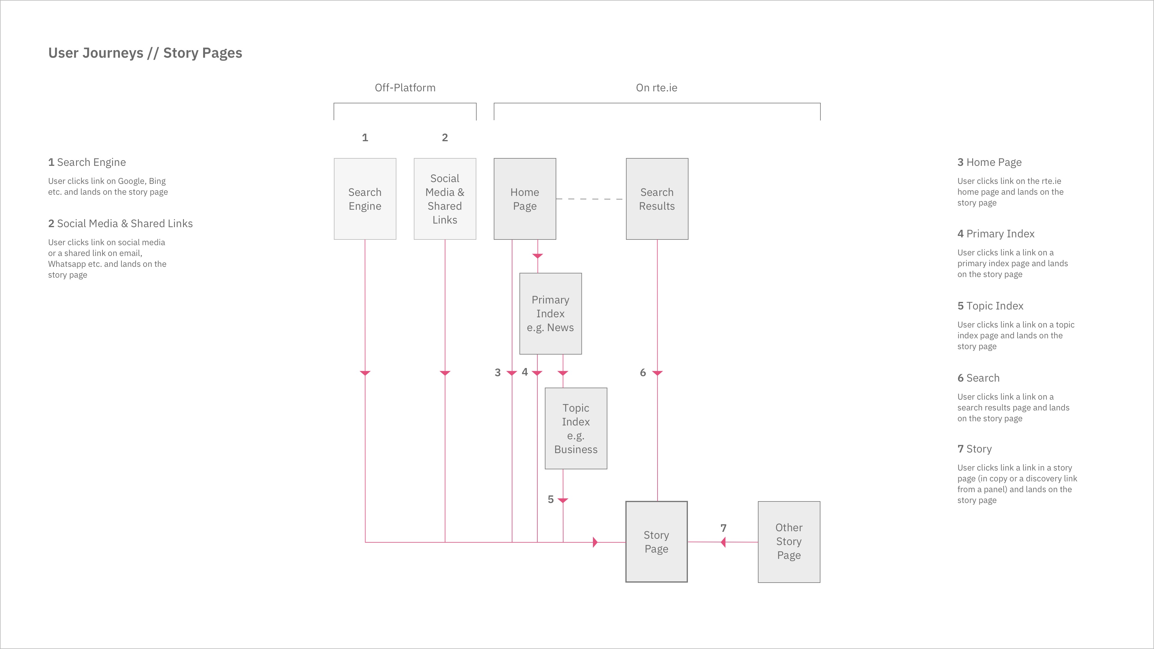
Slides from my project design documents showing Information Architecture and User Journeys for story pages
I refine the wireframes to create high-fidelity prototypes for all panels and page templates in three breakpoints (mobile, tablet and desktop). Prototypes are uploaded to Invision, discussed with the project team and shared with developers. Principle videos/.gifs are also provided to show how certain interactions and transitions should animate.
Once the approved designs are built, they are deployed to a test environment and docs with screenshots are used to audit the test site for any style or functional issues. Once updates are signed off, the developers deploy them to the live site with bi-weekly releases.
Any new page template or panel design is incorporated into the rte.ie design library, which can be synced by other designers so they can work on the most up-to-date version of the design system.
Design System
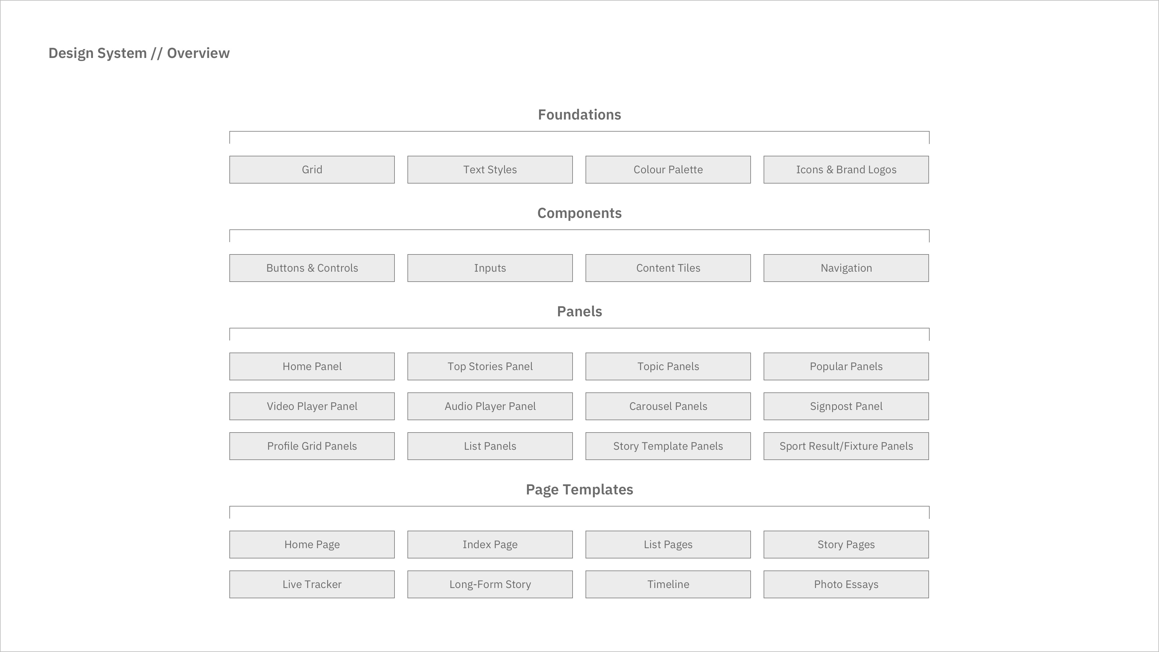
Over time, I have been able to develop a formal responsive design system for rte.ie. This helps keep track of the current product state but also makes it easier to focus on improving specific parts of the site separately. This design system is made up of:
- Foundations: Grid, spacing, colour palette, icons, text styles, logos and other assets that inform the visual language of rte.ie.
- Components: Small interactive elements e.g. clickable story tiles, buttons, inputs, navigation elements and media controls.
- Panels: Stackable, moveable groups of components.
- Page Templates: Overall layouts for different types of pages on the website e.g. home page, index page, story page.
Foundations
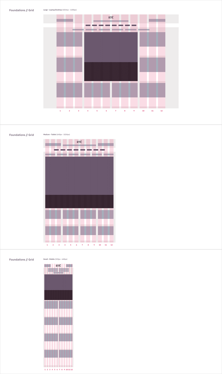
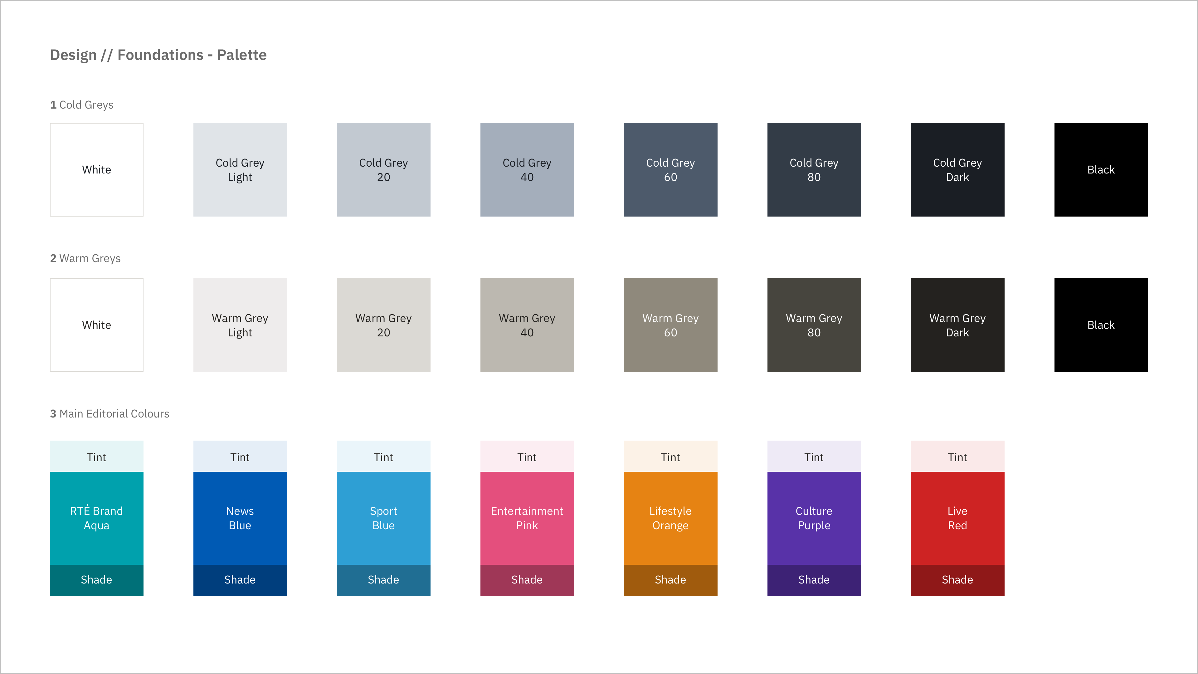
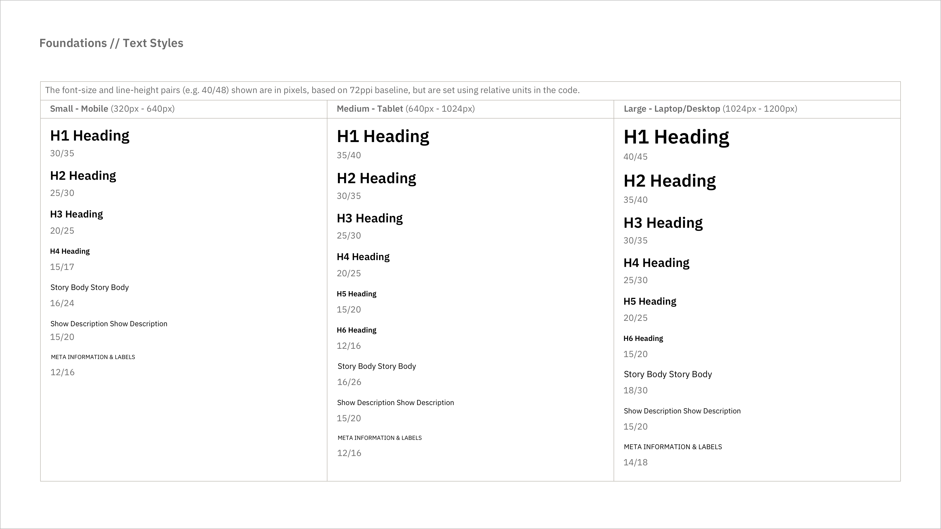
The site is built on a 12-column foundation grid. The text styles help to keep a similar weight and hierarchy for text elements across different devices. The palette includes warm and cool grey palettes and accent colours for each editorial area, which are applied to navigation, links and other elements to help users identify where they are. Simple clear icons mark special types of content and available user actions.
Design foundations for rte.ie from the Project Design Document [Click to zoom].
Components
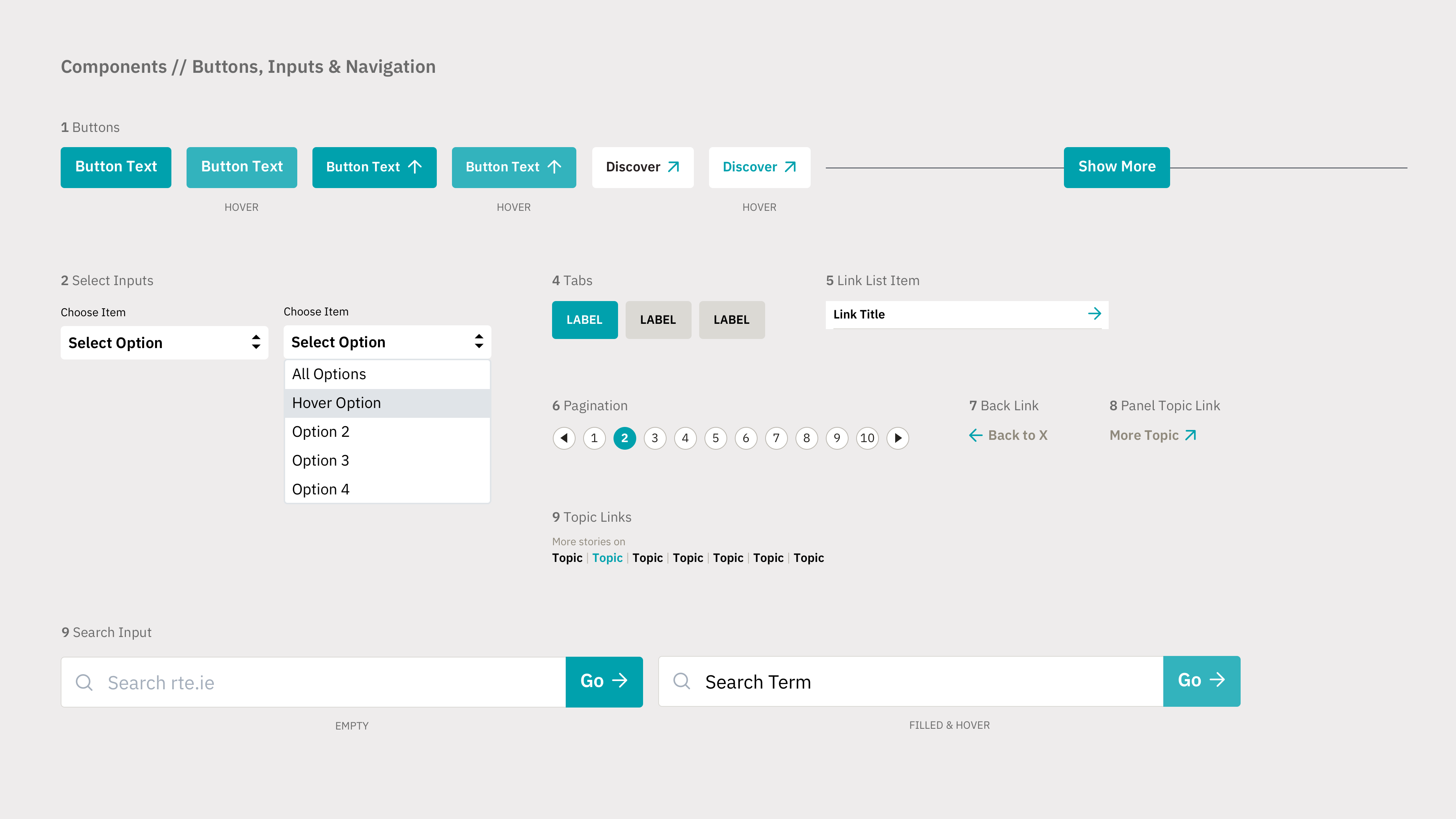
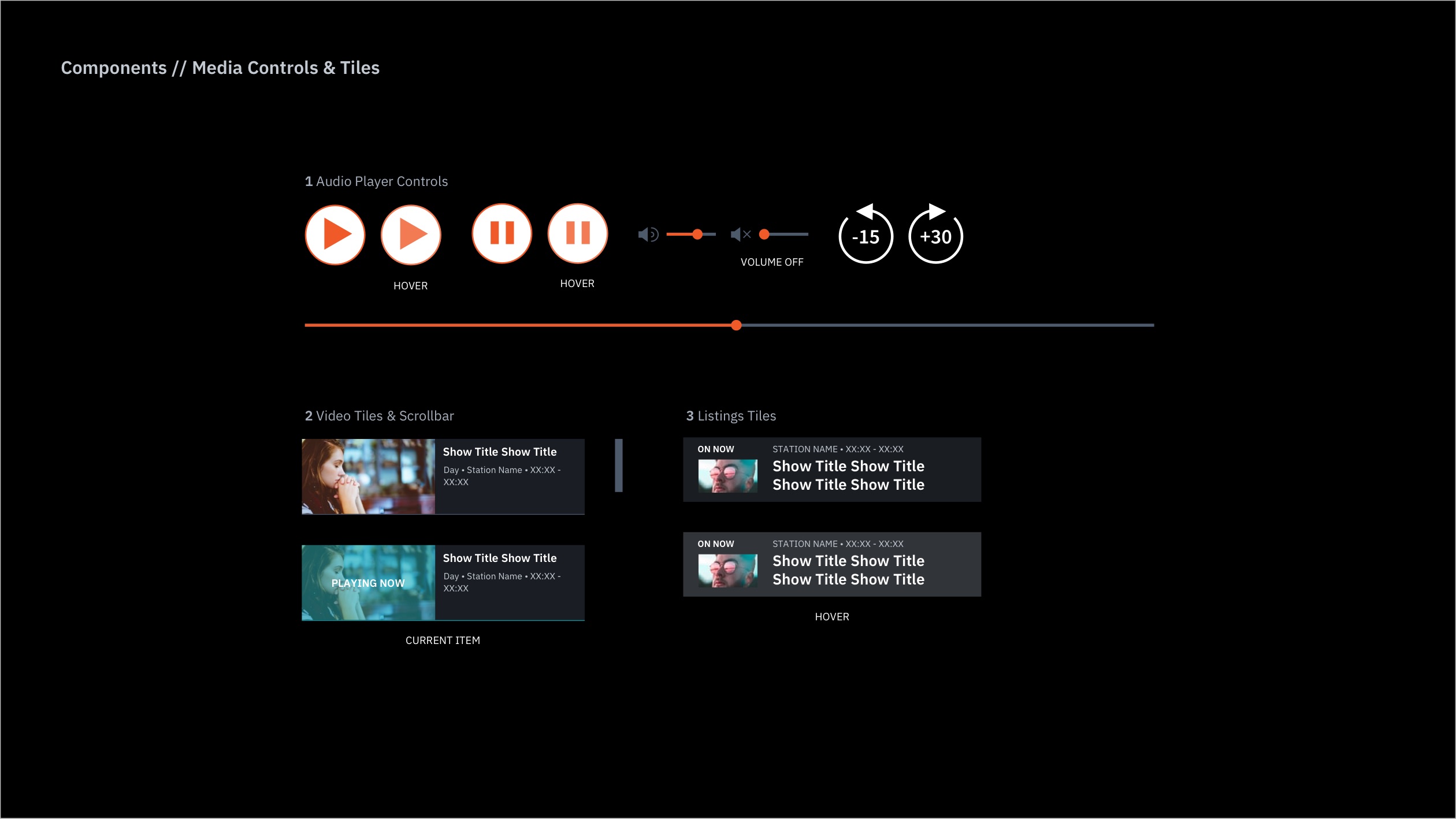
Interactive components like story tiles, buttons, inputs, navigation elements and media controls allow users to control their browsing experience on rte.ie. Some components have different variants and states which are covered in developer handoff.
Slides showing some rte.ie components with variants and states [Click to zoom].
Panels
Panels are moveable patterns made up of components that can be added to and re-arranged on pages by the editorial teams. Before 2016, editors for each index on rte.ie (e.g. News, Sport) fed a ranked list of stories into a pre-set page structure. Adding a new section to a page always required some development work. One of the biggest updates to the RTÉ’s CMS (Content Management System) in recent years was the Panel Builder. This allows homepage and index editors to build fully customised page layouts using a variety of stackable, moveable panels of stories, video, audio and other data. Panels can be populated via ranked story lists, display content based on tags or be fully curated.
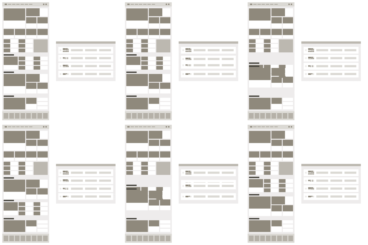
Re-ordering panels with the panel builder in the CMS
Story Tiles
Story tiles are the most flexible and commonly used component in the rte.ie design system. Each story tile is a snippet of a full story and is usually made up of: an image, a headline, a topic and an optional icon. Story tiles are the entry point for the user to a story page from any other page on rte.ie.
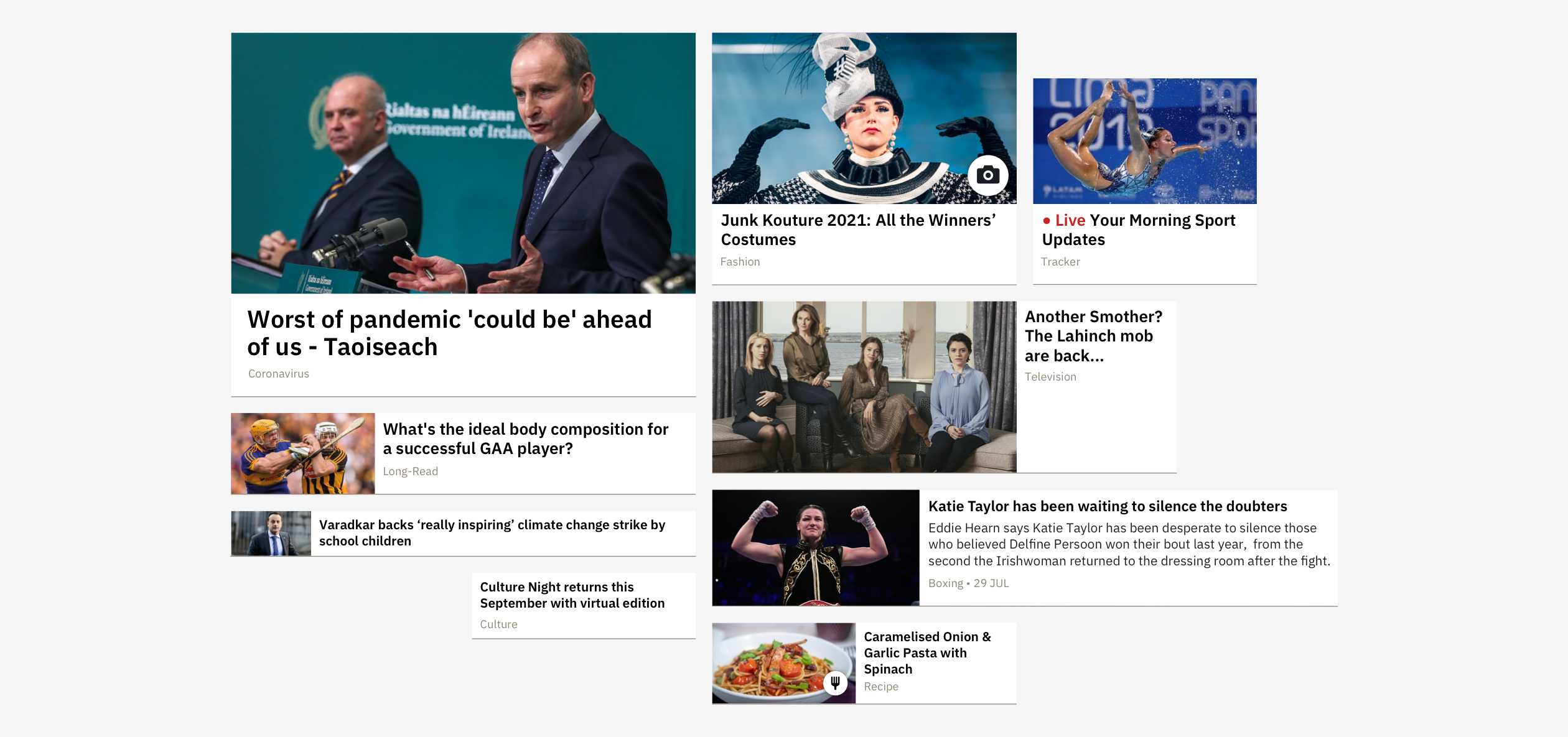
Examples of various-sized story tiles used in rte.ie panels
Published Status
Editors can set a published story to have a status of updated, latest, breaking, live, exclusive or upcoming.
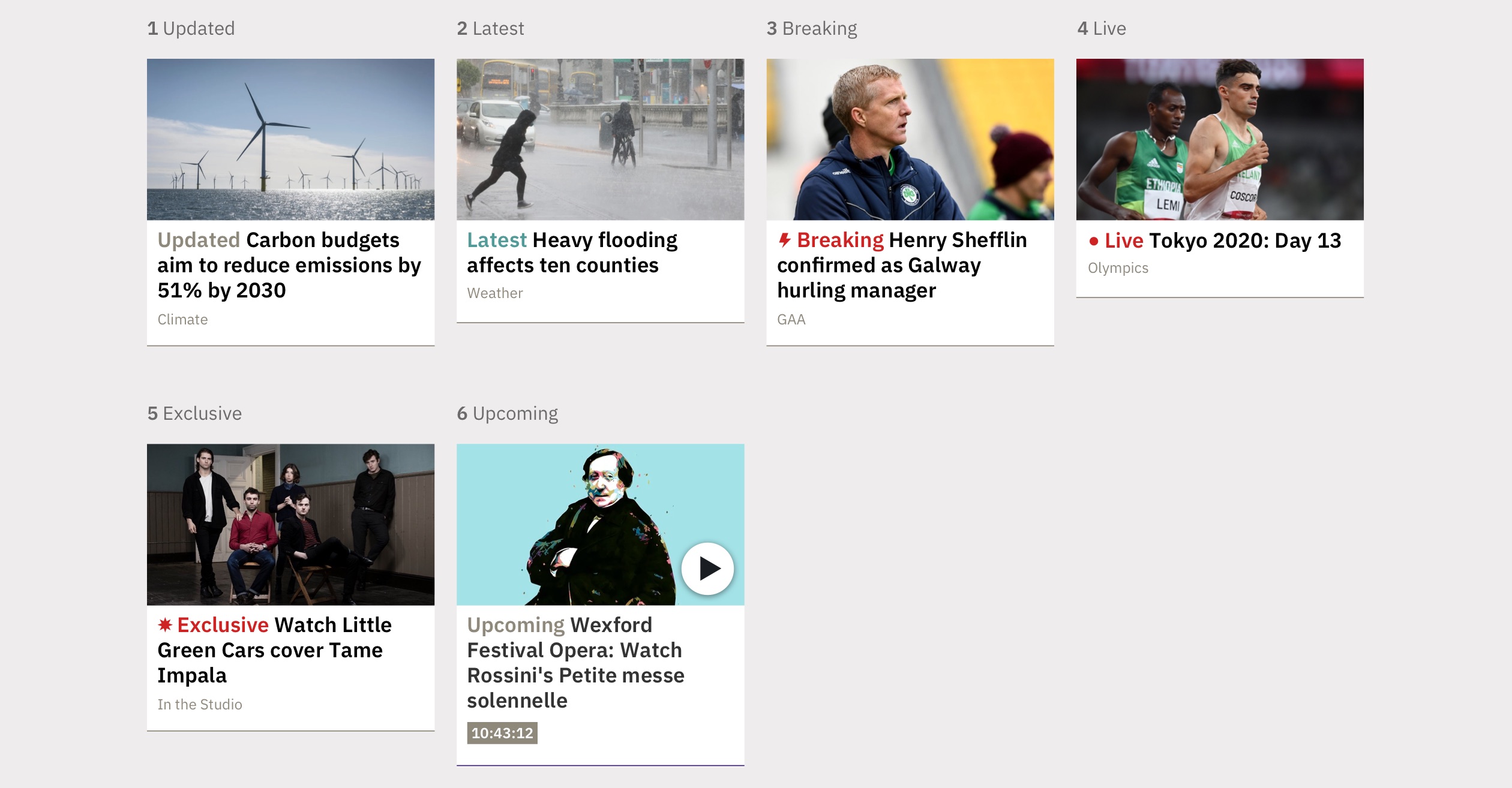
Story Tile published statuses
Story Tile Icons
Editors can also use icons to flag certain types of content – currently video, audio, gallery, analysis, recipe and review icons are available.
Story Tile icons
Story Groups
The Home and Top Stories panels (covered below) both allow editors to add related stories to various story tiles within the panel, creating groups of similar content.
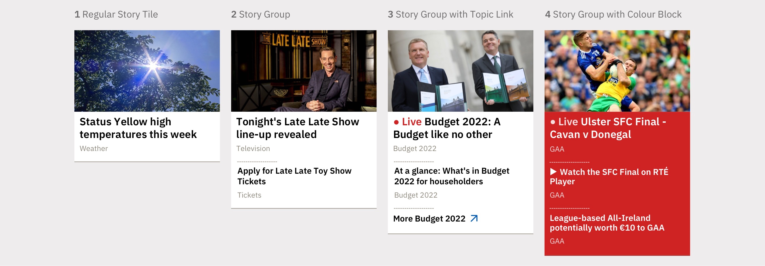
Story Group variations
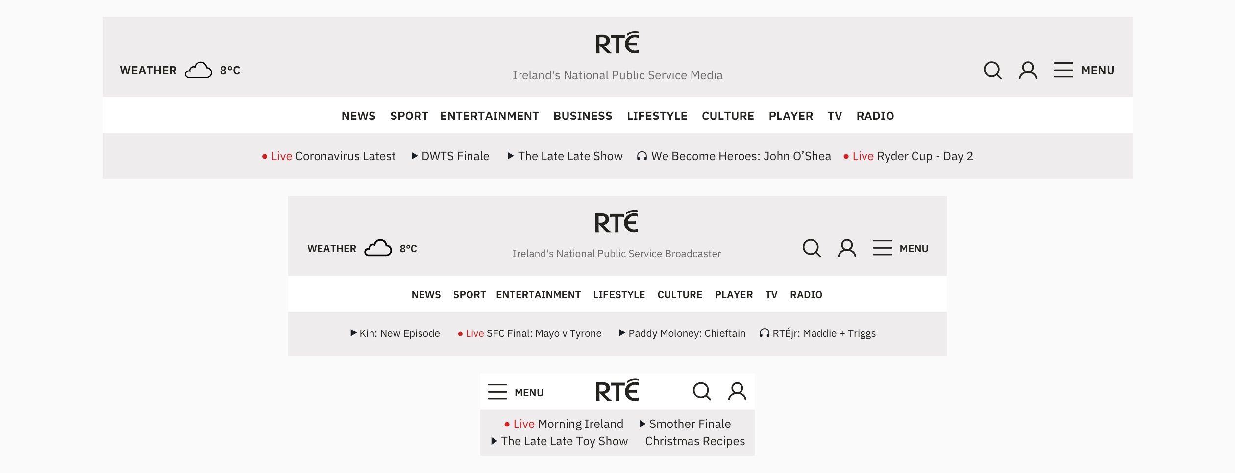
Responsive designs for the homepage masthead navigation
Index and Story Page Navigation
On index and story pages, a more compact primary navigation bar is displayed. A topic bar features a breadcrumb trail and lists secondary and tertiary links for the parent index.

Responsive designs for index and story page navigation
Mobile Menu
The mobile navigation experience on rte.ie aims to match larger devices but collapses the topic bar into expandable menu items.
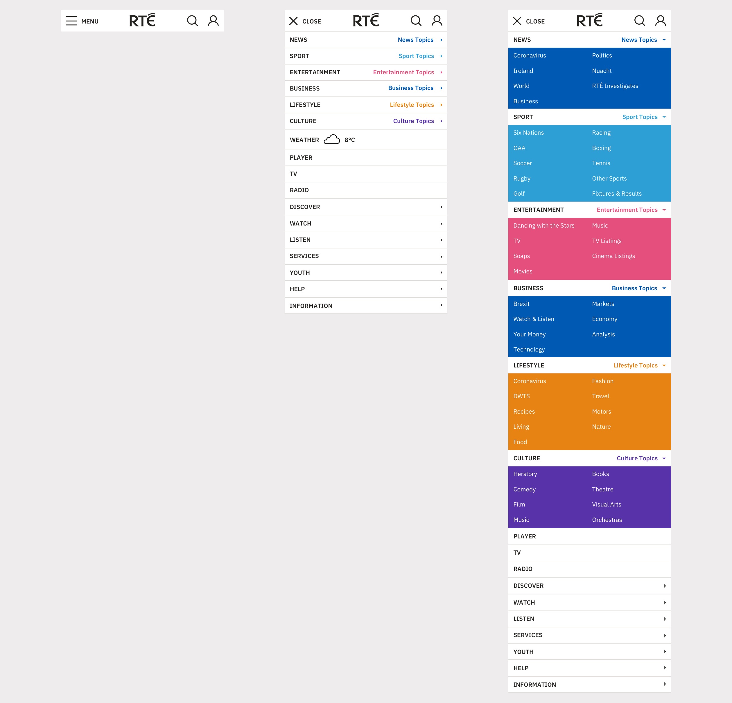
Closed, open and expanded mobile navigation
Fixed Navigation
When a user scrolls, a compact primary navigation bar remains at the top of their window to allow users to quickly access other parts of the site at any time.
Search
Over 40% of traffic to stories on rte.ie comes from search engine referrals, so usage of the search functionality on the site is limited. The search input can be accessed anytime from the navigation bar. The search results (built using Google Custom Search Engine) are displayed in an unweighted, paginated list by relevance or date.
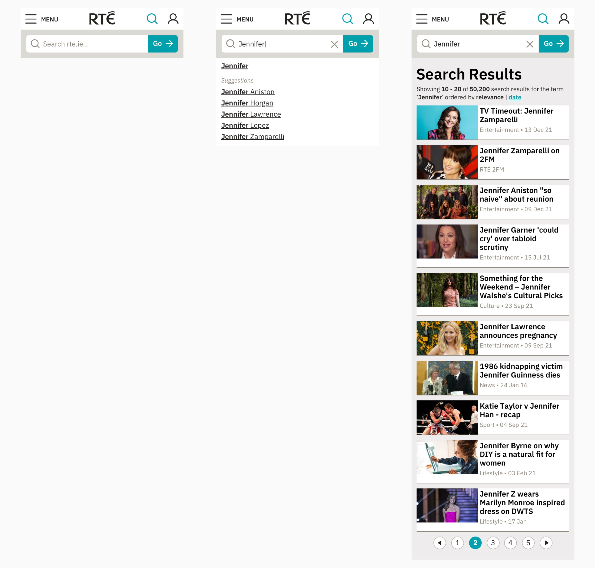
Mobile search experience
Menu and Footer
Some smaller, niche and lower-usage index pages on rte.ie are categorised and listed in a sitemap-style menu available in the top navigation bar and the page footer.

Menu open/close animation
Global Navigation
A dark, simpler variant of the primary navigation bar is used as a global navigation bar on RTÉ Radio, RTÉ Archives and other RTÉ websites to help users easily reach rte.ie.

Responsive designs for the global navigation
Home Page
Below i’ll go through some of the responsive panels that can be added to and rearranged on the home page, followed by examples of the curated home page populated by these panels.
Home Panel
The rte.ie home page team have to try to represent all of the most important RTÉ story, video and audio content at any given time. The home panel allows them to give prominence to the most important story now – usually a News or Sport story, while also featuring the best stories from other editorial teams. Related stories can be added to most positions in the panel, allowing users to access multiple stories on a topic easily.
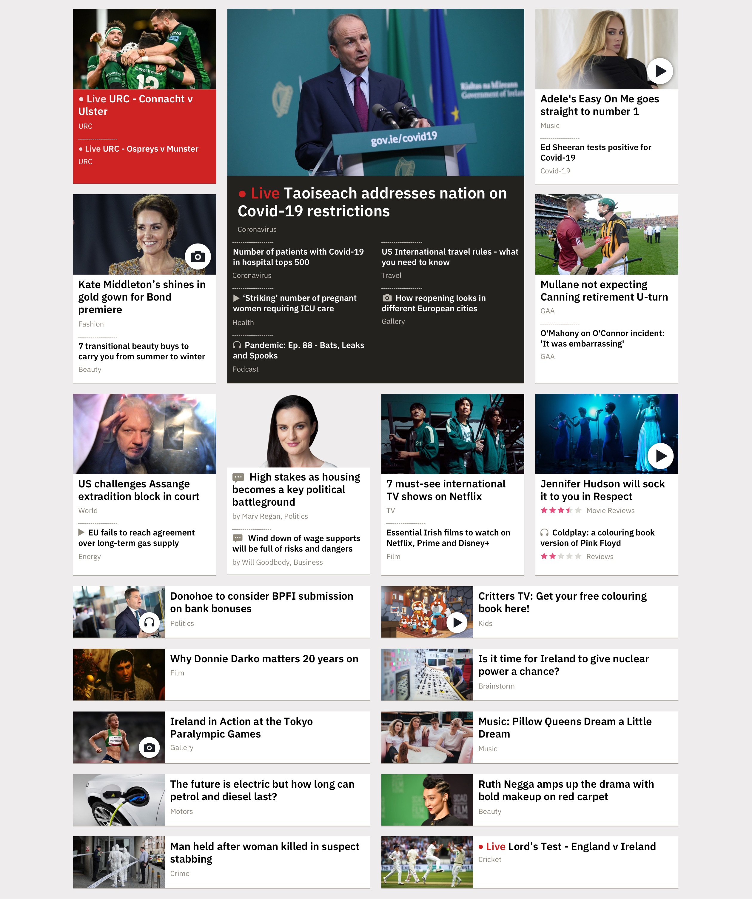
Curated home panel on desktop
Top Story and Takeovers
The top story in both the Home and Top Stories panels generally covers the biggest story of the day, so a lot of supporting content like video, audio, analysis, galleries or long-form is usually available to add as related stories. Up to 8 related stories can be added to the top story.
Editors can also turn on ‘Takeover’ or ‘Fullscreen Takeover’ mode, which gives the top story more prominence on all devices. Sometimes a story starts small and builds so having a variety of states for the top story can help to develop the story visually over time.
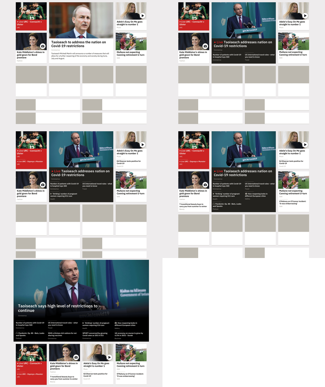
Top Story growth on desktop showing takeover and fullscreen takeover modes
Video Player Panel
The Video Player panel allows editors to add rte.ie short-form video clips to a playlist to be viewed on the home page or index pages. The playlist auto-plays the next video in the list until the user reaches the end.
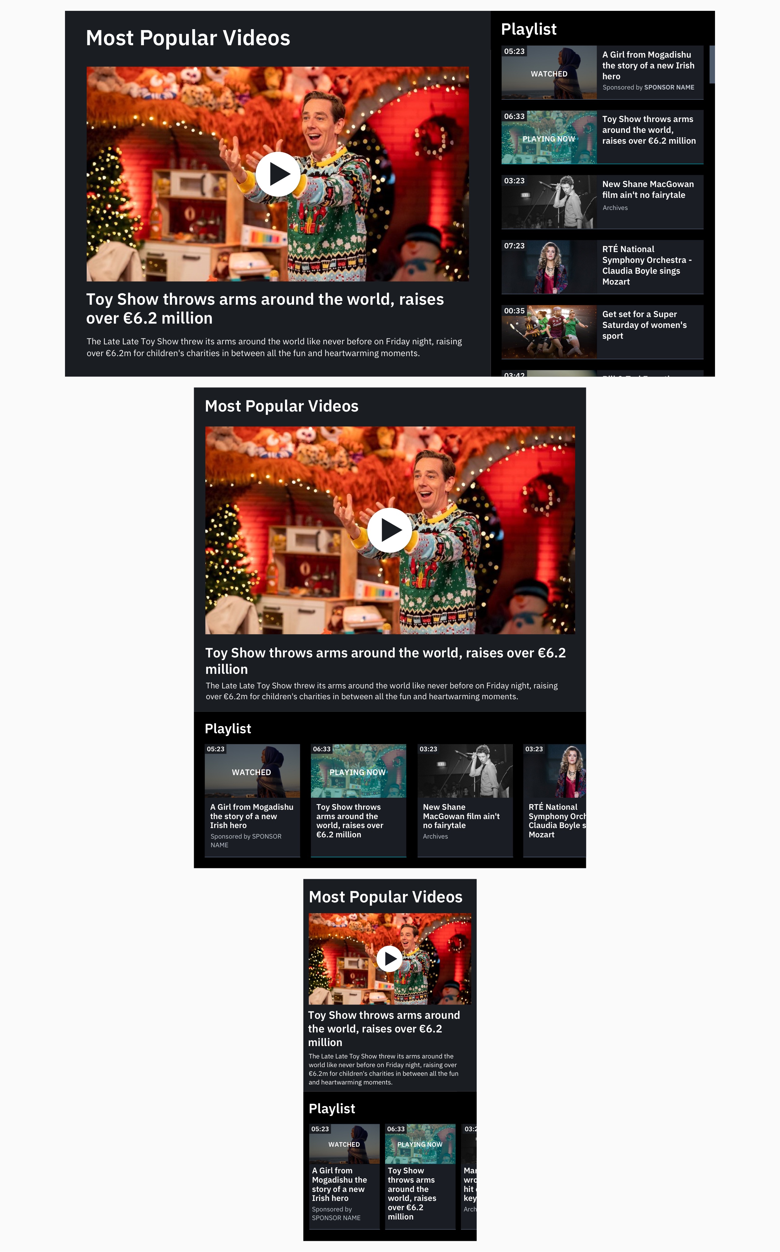
Responsive designs for the Video Player panel
Audio Player Panel
The Audio Player panel uses the same auto-playing playlist pattern as the video player, but holds audio content such as radio episodes and clips or podcast episodes. The visual language and controls for the Audio Player panel match those used on the RTÉ Radio platform to increase consistency across the platforms.
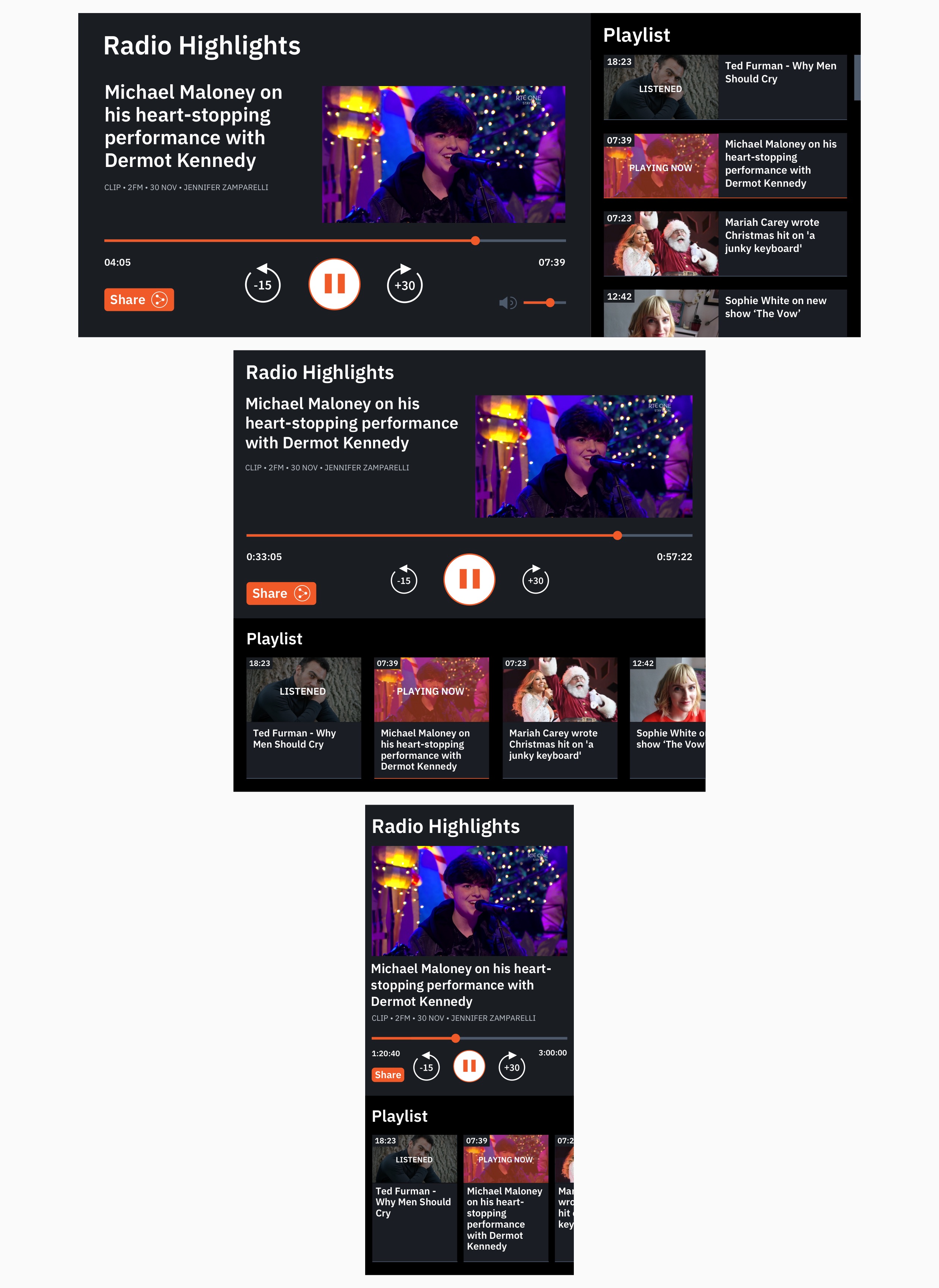
Responsive designs for the Audio Player panel
Most Popular Panel
The Most Popular panel displays an aggregated list of the most popular content across rte.ie in the last 12 hours. As part of a move to highlighting more audio and video content across the site, a tabbed interface was introduced to allow users to view the ten most popular stories, videos and audio clips in separate lists.
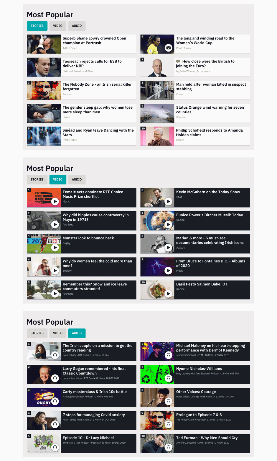
Desktop view of the Most Popular panel with tabs for stories, video and audio
Home Page Populated
Here are examples of the home page including the home, video player, audio player, topic and most popular panels populated with a mix of content from all RTÉ editorial teams.

Desktop and mobile examples of the rte.ie home page with a mix of curated content
Index Pages
Index pages are the main discovery pages for top-level editorial topics e.g. News, Sport, Entertainment, Lifestyle, Culture as well as sub-topics e.g. Coronavirus, Reviews, Recipes. Editors can create customisable page layouts populated with stackable, moveable panels of story, video and audio tiles using the panel builder.
Along with the panels used on the home page, the panels below can be added to and rearranged on index pages.
Top Stories Panel
The Top Stories panel is similar to the home panel and is intended to be the top panel on all index pages. The panel is populated by a list of stories ranked by the index editorial team. Analytics showed that users engaged with related stories on the home panel so this functionality was also made available in the Top Stories panel. There are several panel variants for use in situations where more or less content is available.
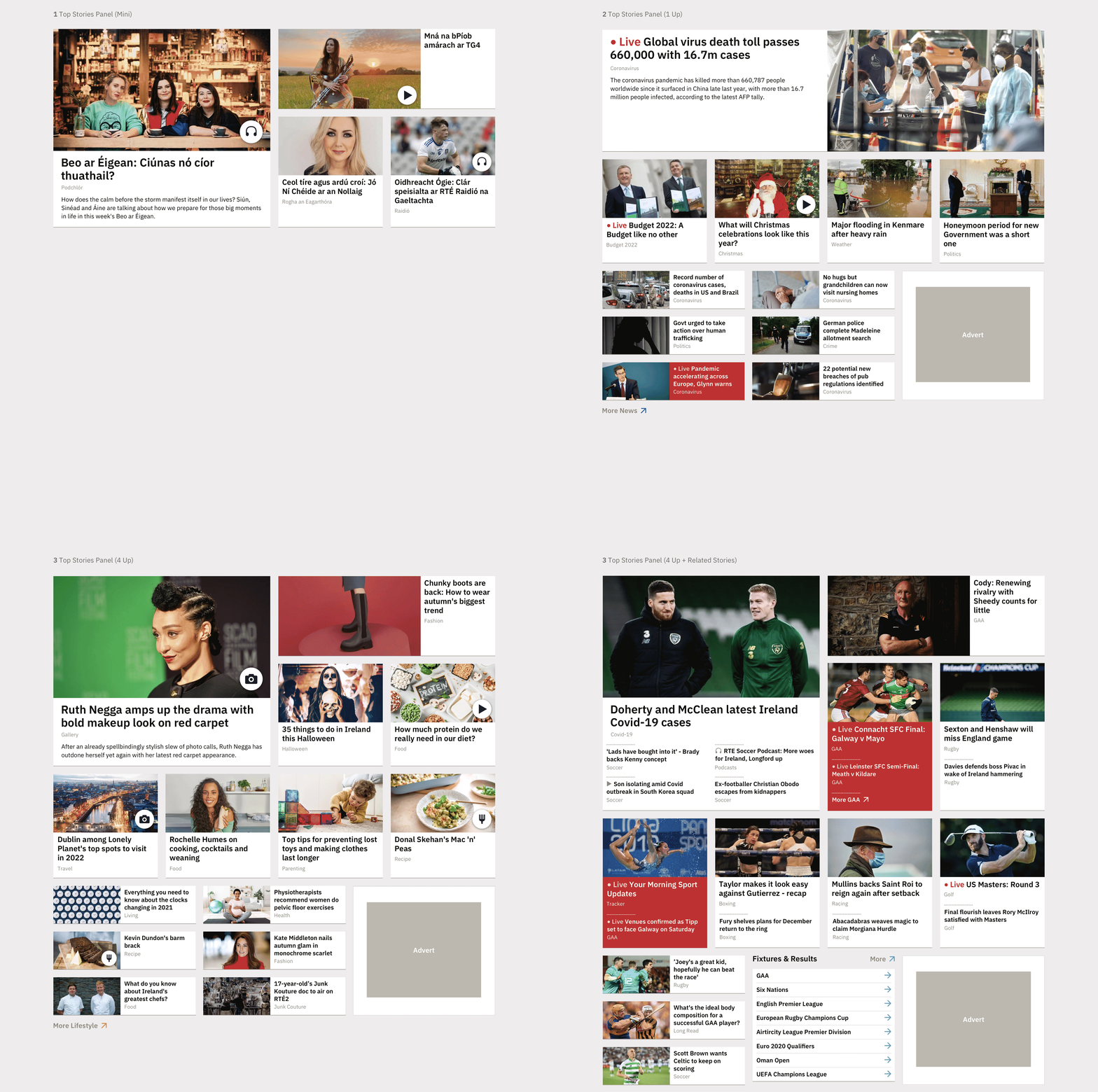
Desktop variants of the Top Stories panel
Topic Panels (A,B,C)
Topic panels are the most-used panels on rte.ie. They are lists of stories. Editors typically stack panels focused on different topics one above the other on their index pages. There are currently three options: Topic A holds 7 story tiles, Topic B holds 4 story tiles and is good for highlighting stories with strong photography, Topic C holds 5 story tiles and is a more compact, text-based layout.
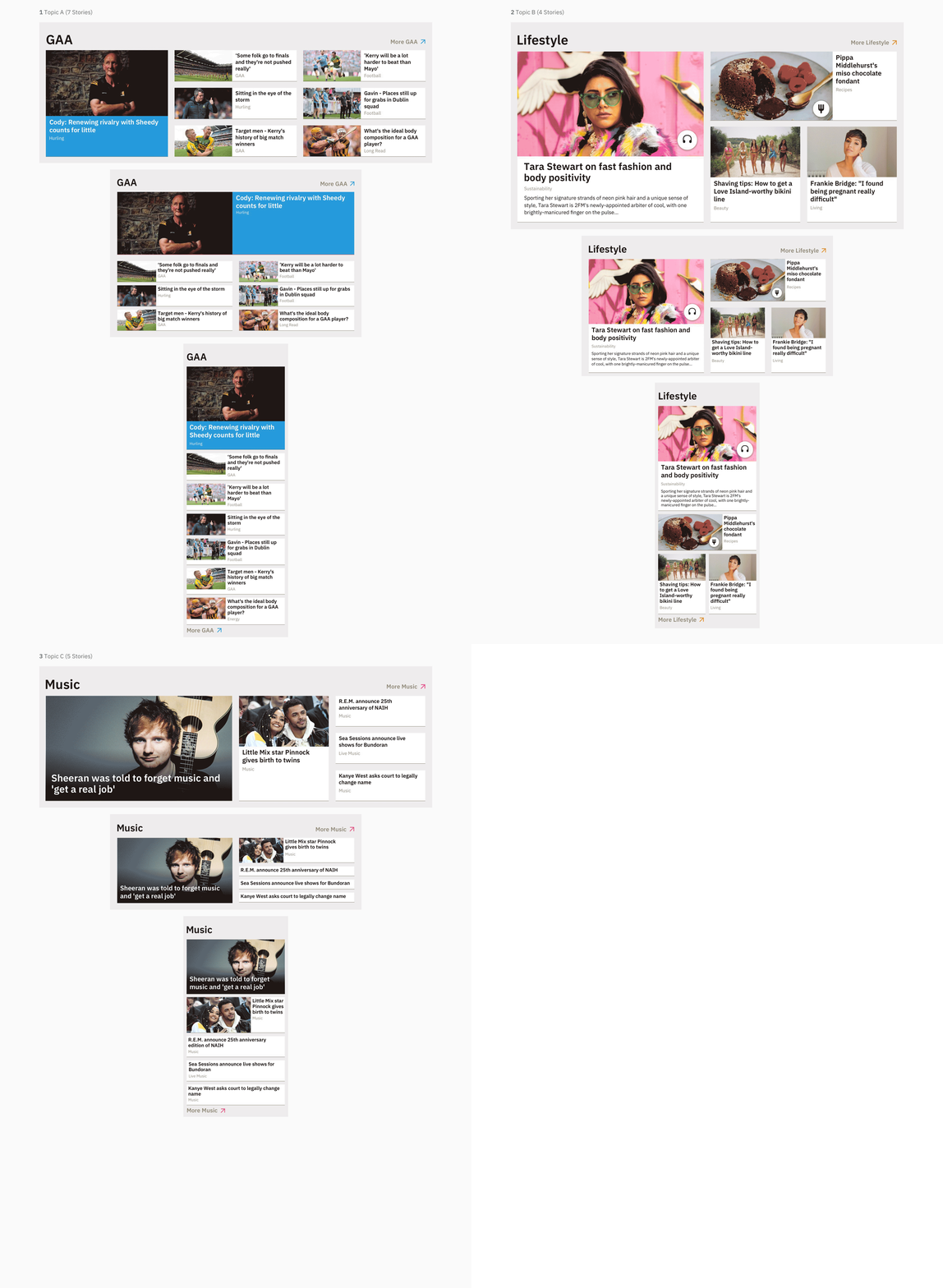
Responsive designs for the Topic A, B and C panels
Signpost Panel
The Signpost panel allows editors to add a large, colourful link (with optional search input) to another page on an index page. It can be a good way to highlight a section with a lot of content e.g. Olympics, Recipes from elsewhere on rte.ie.
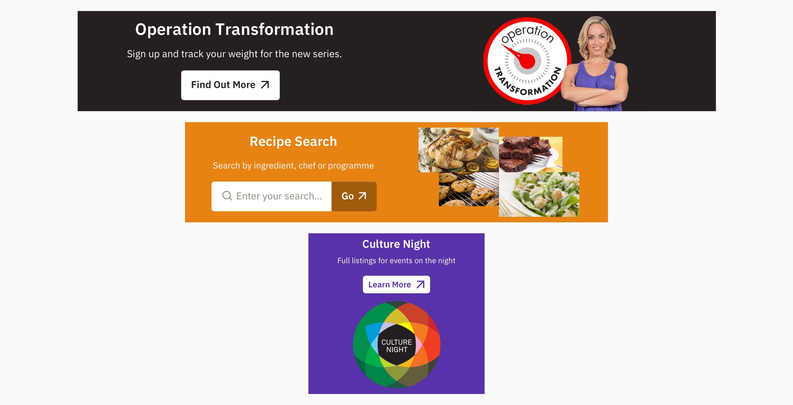
Responsive designs for the Signpost panel
Index Pages Populated
Here are examples of various rte.ie index pages showing the top stories, topic, video player, audio player, signpost and most popular panels in use.

Desktop and mobile examples of the Sport and News index pages

Desktop and mobile examples of the Lifestyle and Entertainment index pages
Panels with Specific Uses
Some panels on rte.ie have more specific uses – i’ll go through some of these below.
Brochure Panel
The Brochure panel allows an editor to add a branded feel to an index page. RTÉ is involved in running or promoting lots of different events throughout the year. In the past, separate WordPress sites were built for different events. However, the Brochure panel allows editors to build a page within rte.ie for an event. The brochure panel is a variant of the Top Stories panel but can take a background image, a logo image, sponsor/partner image, a text heading and a text description. Each of these elements can be turned on/off as needed.
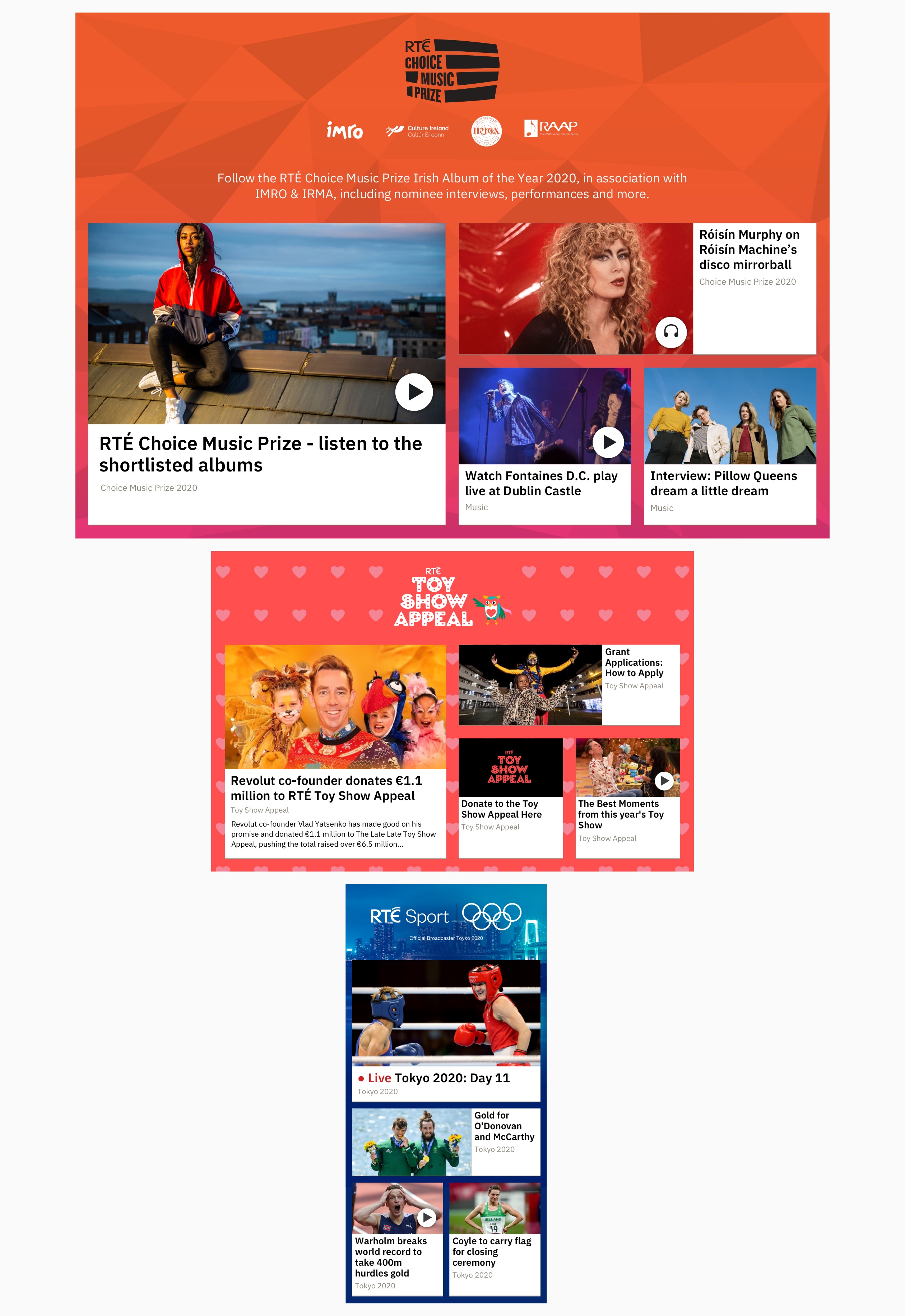
Responsive examples of the Brochure panel for the Choice Music Prize, the Toy Show Appeal and the Tokyo 2020 Olympics
Profile Grid Panel
The Profile Grid panel allows editors to add a filterable list of people with associated information which can link to relevant pages. This panel has been used to display athletes, election candidates, authors and more.
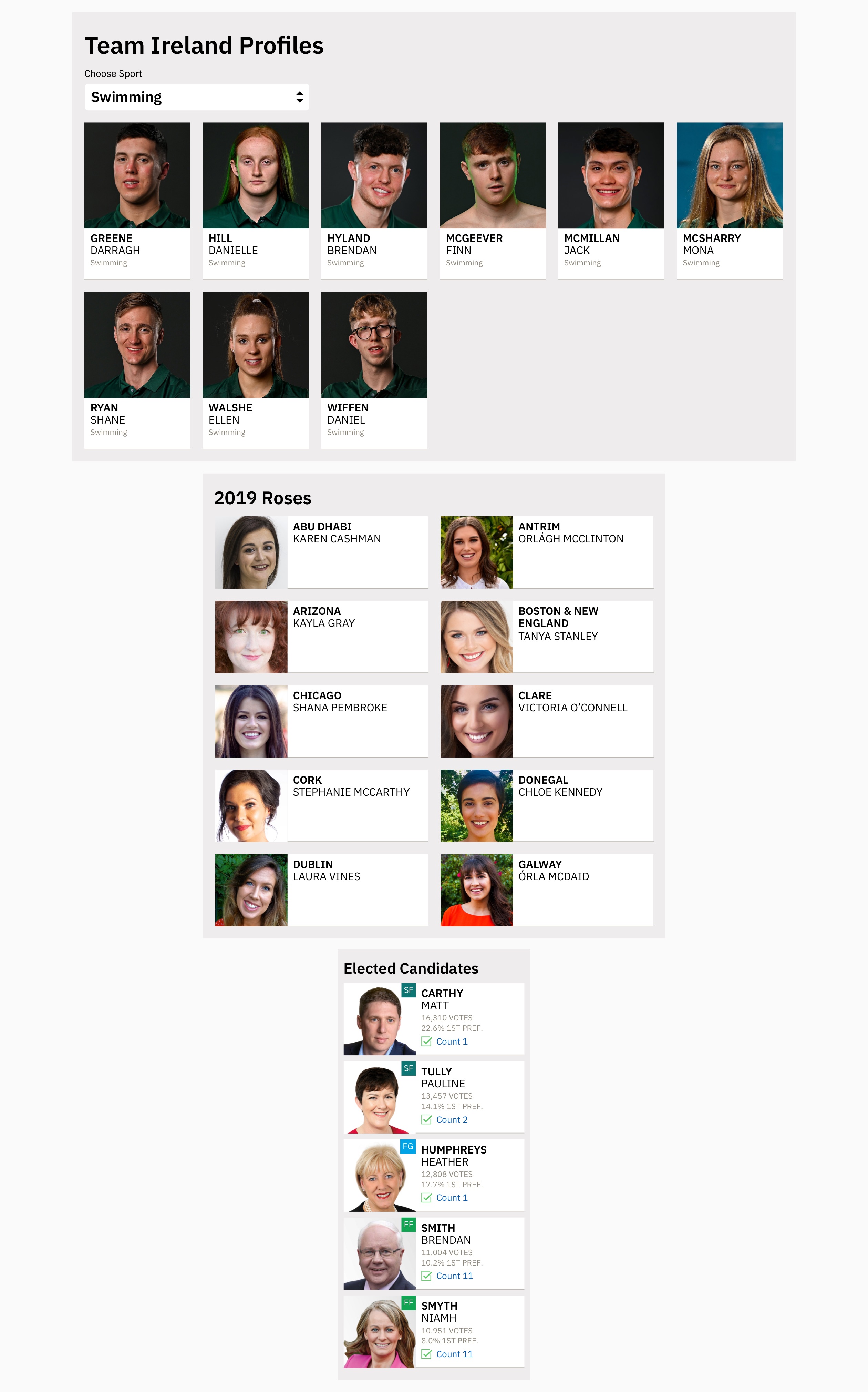
Responsive designs for the Profile Grid panel
Carousel Panel
Carousel panels are horizontal scrolling panels of content mainly intended for use on certain parts of the site e.g. TV and radio. They are generally stacked in groups without adding other panels between and have light and dark variants.
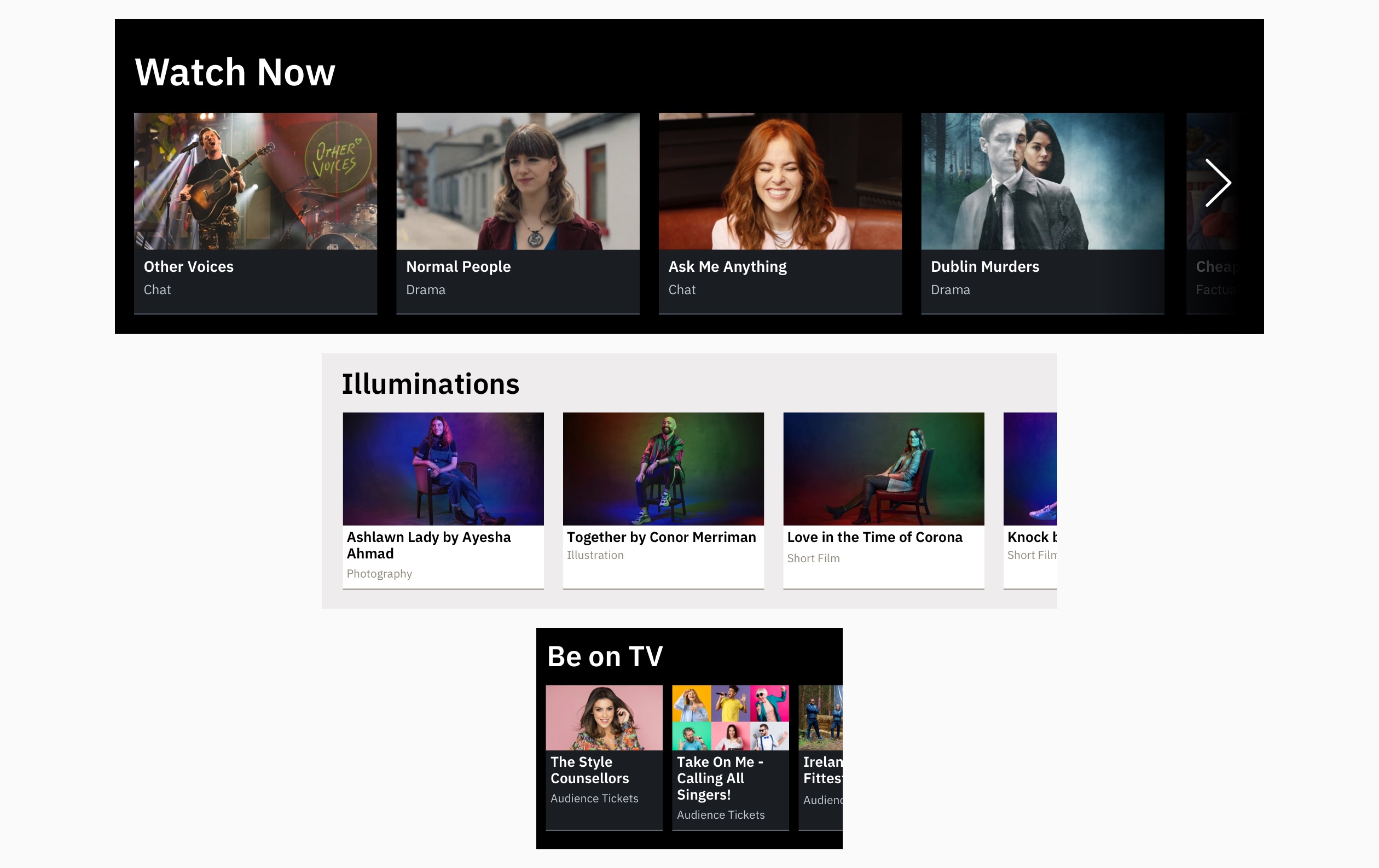
Responsive designs for the Carousel panel
Live Radio Carousel Panel
This panel was designed during my work on RTÉ Radio, and displays the current show streaming on each of RTÉ’s nine radio stations, which links to the station page playing the live stream for each one.
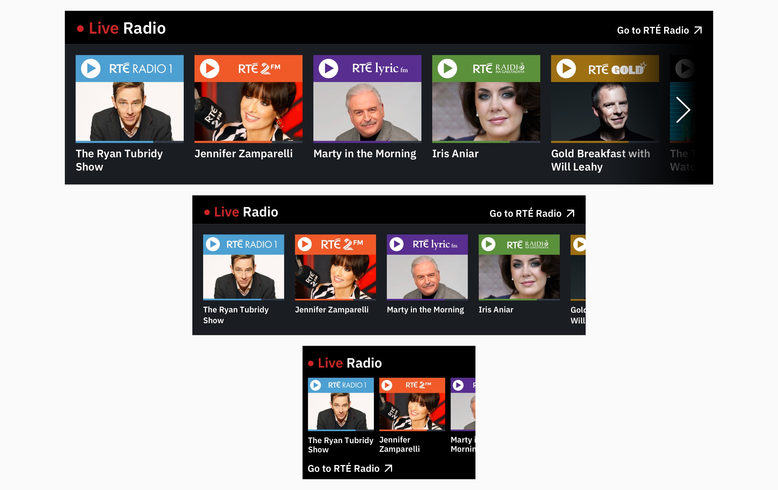
Responsive designs for the Live Radio Carousel panel
Top 5 Panel
The Top 5 panel is a compact panel that allows the homepage team to highlight the top 5 headlines from certain indexes.
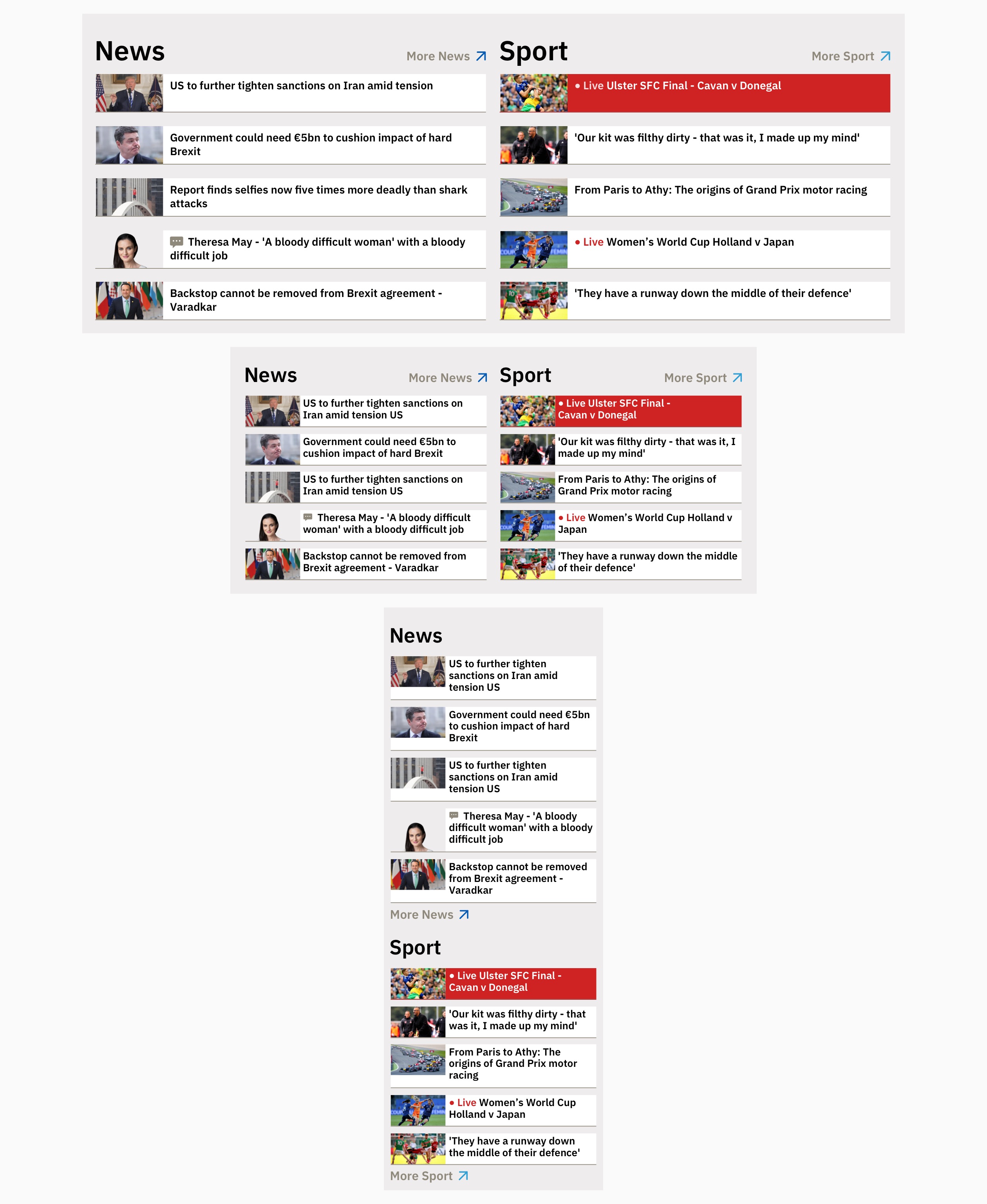
Responsive designs for the Top 5 panel
Listings Panel
The Listings panel allows editors to highlight the next three live shows on RTÉ’s TV stations or RTÉ’s radio channels and links to the TV and Radio listings pages.
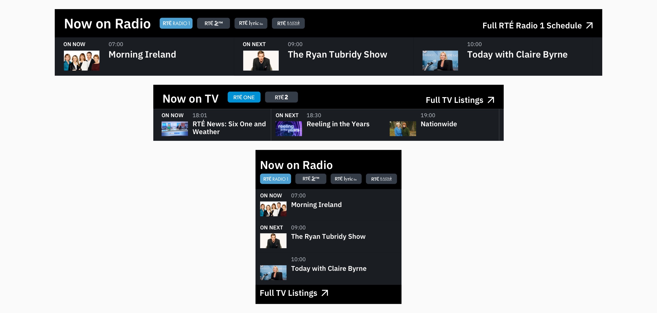
Responsive designs for the Listings panel
TV Index
The TV index is used to promote new TV programmes, competitions and user participation content relevant to linear TV programming on RTÉ One and RTÉ 2. It is dark themed and features some specific panels not used elsewhere on rte.ie including the Programme Hero Slider, Schedule and Programme Grid panels.
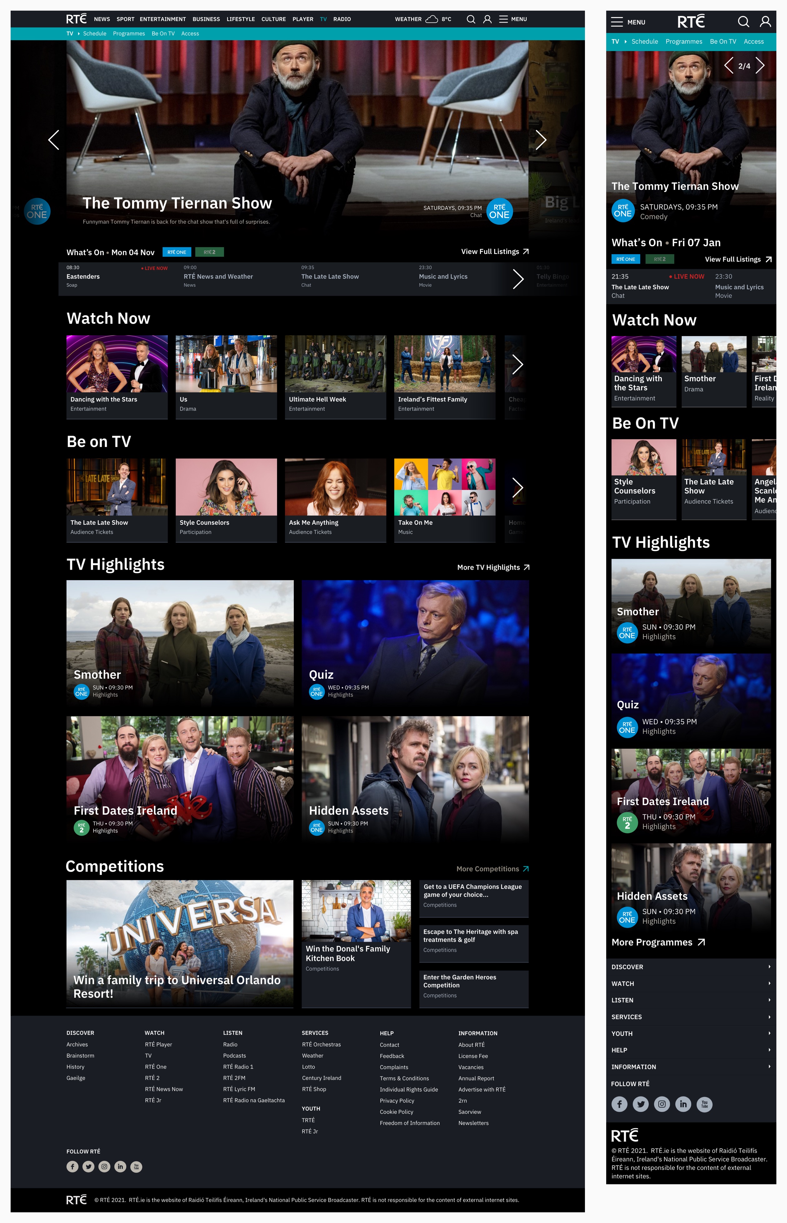
Desktop and mobile examples of the TV index page
List Index Pages
Each time an editor tags a story with a topic, an index page for that topic is automatically created. These stories are displayed in a topic list page which is a basic, unweighted, paginated list of story tiles. Editors can promote a topic index page to a managed index, which then allows them to curate and add panels to the page.
The same list pattern is used to display all stories by a certain author or source and rte.ie search results.
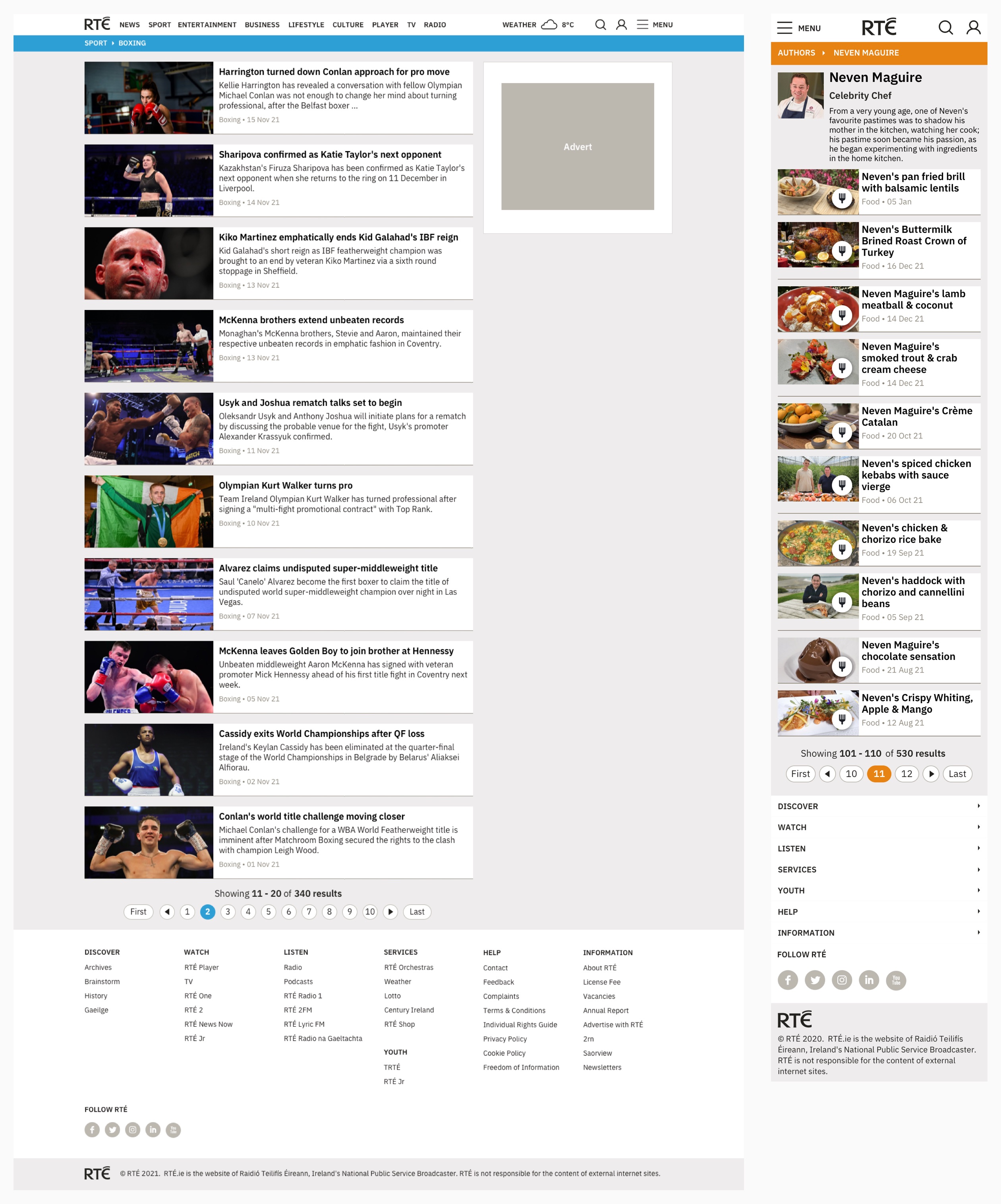
Desktop and mobile examples of a topic and author list index page
Story Pages
The story page is generally the destination on rte.ie. Where index pages allow users to see snippets of content they might be interested in, the story page displays that content in full. Story pages are generally made up of headline, main image, byline and source, text, images, media or social embeds, links, blockquotes and pullquotes.
Below I’ll go through some of the features and panels that can be added to story pages to suggest an onward journey to the user, followed by examples and variants of story pages.
Most Popular Panel
The Most Popular panel displays the six most read stories in the story’s parent index.
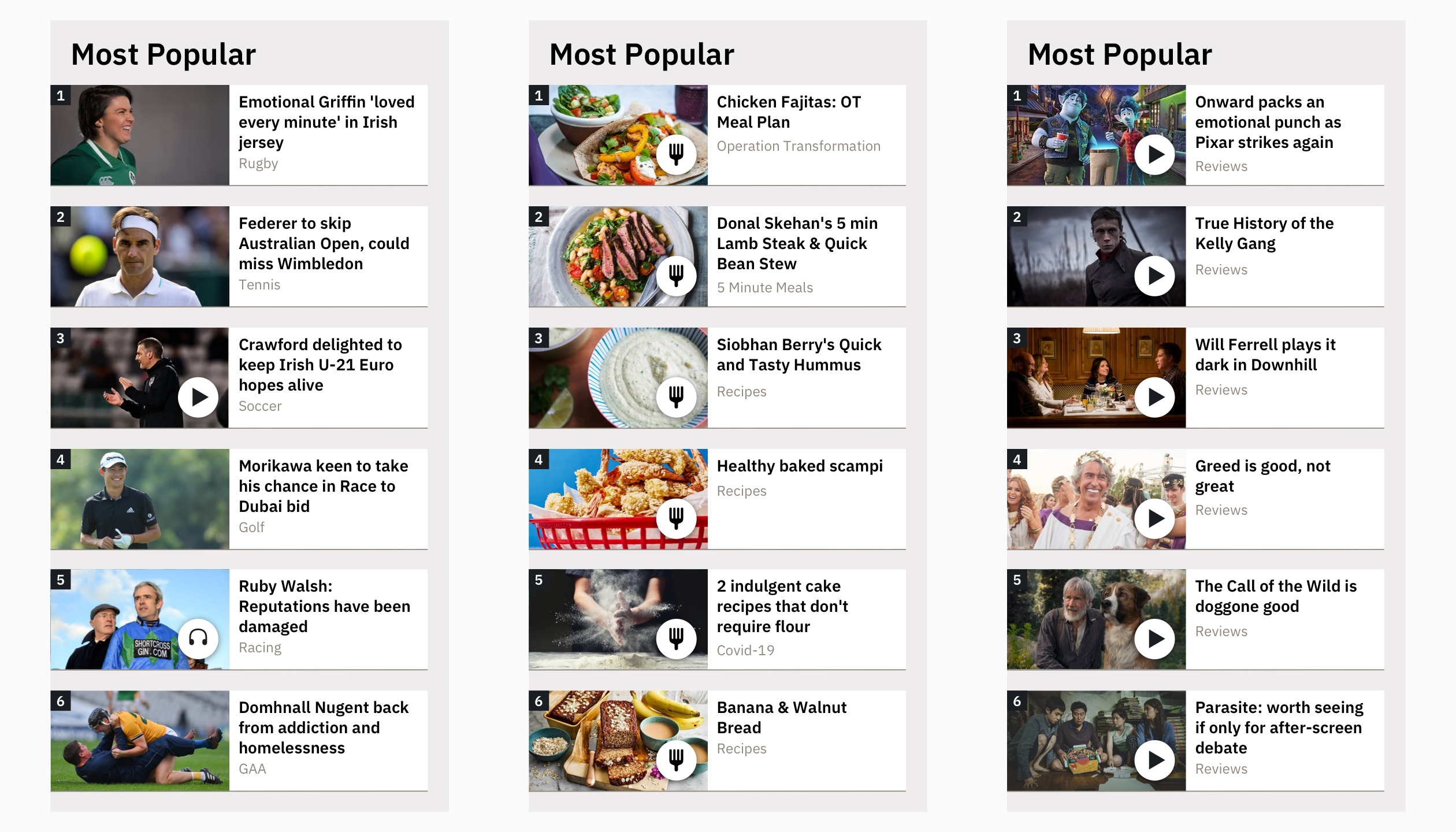
Examples of story Most Popular panels
Story Signpost Panel
The Story Signpost panel allows editors to add a signpost to a URL from every story published within a certain index, usually linking to the parent index or a related part of the site.
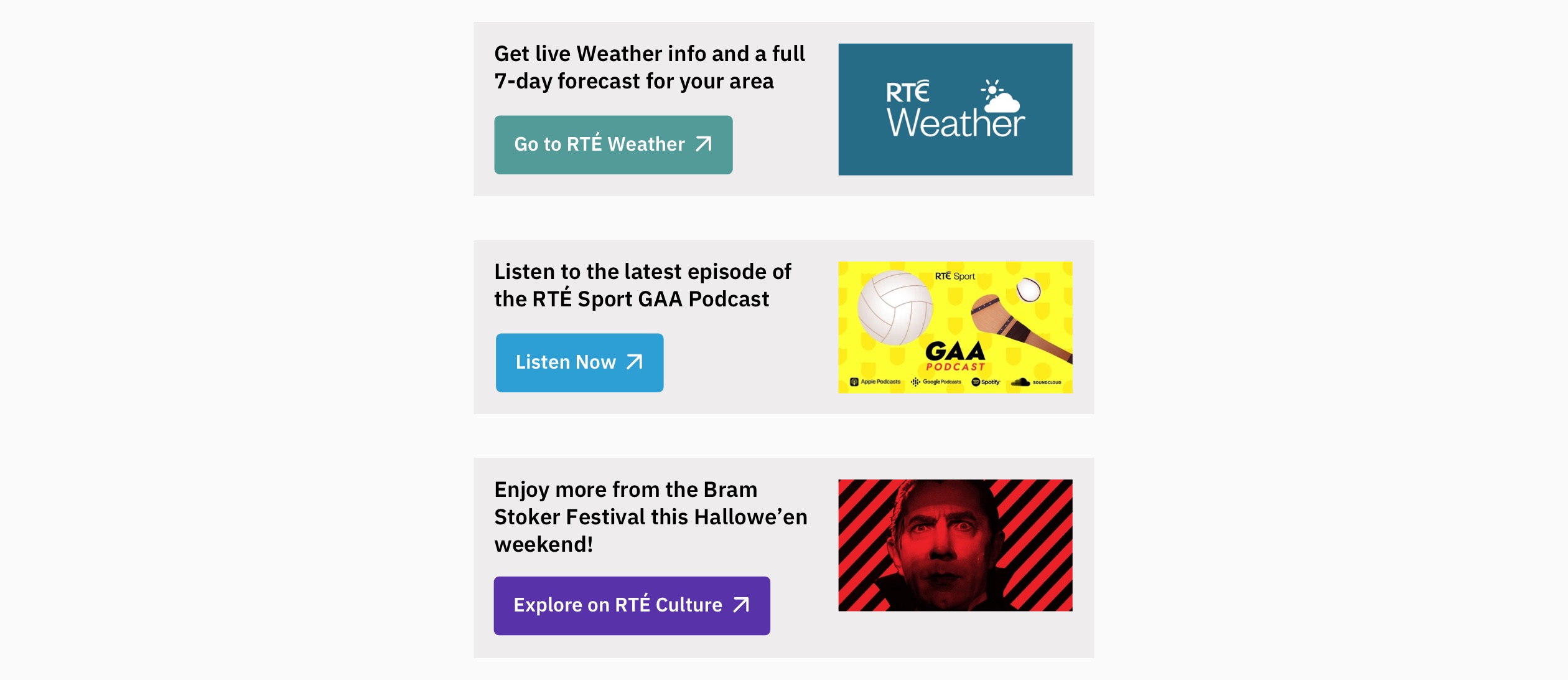
Examples of Story Signpost panels on desktop
Topic Link Panel
The Topic Link panel displays the topics the story has been tagged with. Each of these leads to either the managed index or list index for that topic.

Responsive examples of the Topic Link panel
Author Panel
The Author panel allows editors to highlight more stories written by the same author – good for use with analysis or recipes.
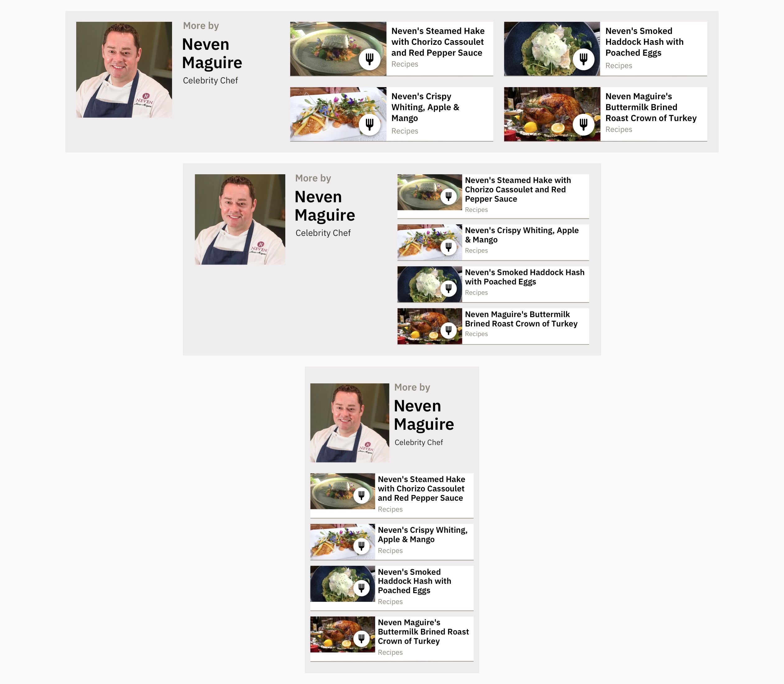
Responsive example of story Author panel
Read Next Panel
The Read Next panel is populated by content a user should enjoy based on their previous behaviour using PEACH, a personalisation and recommendation tool developed by the EBU.
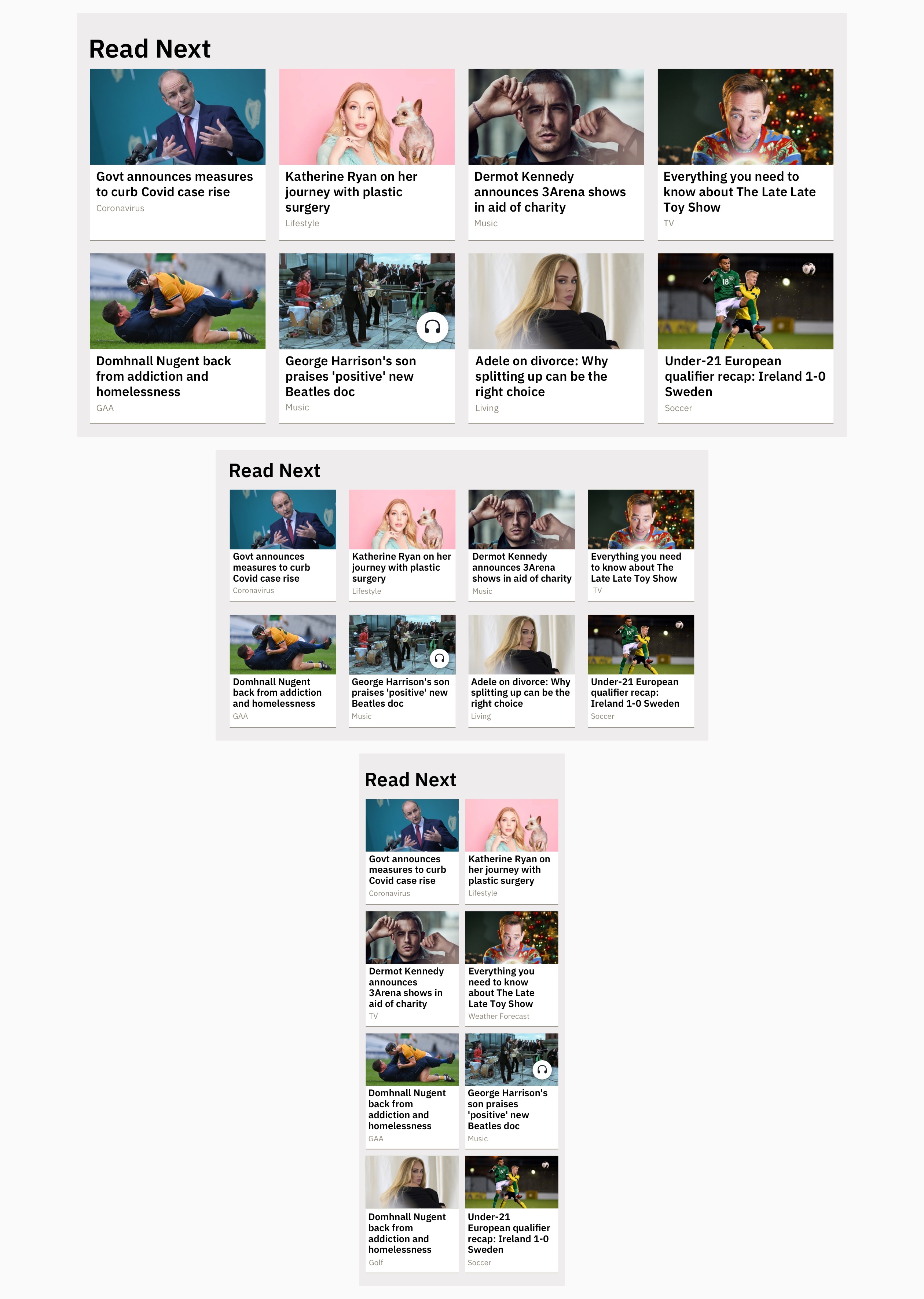
Responsive example of the story Read Next panel
Gallery
If a story has more than one image in it, users can tap a small icon on any image to launch a gallery of all images in the story.
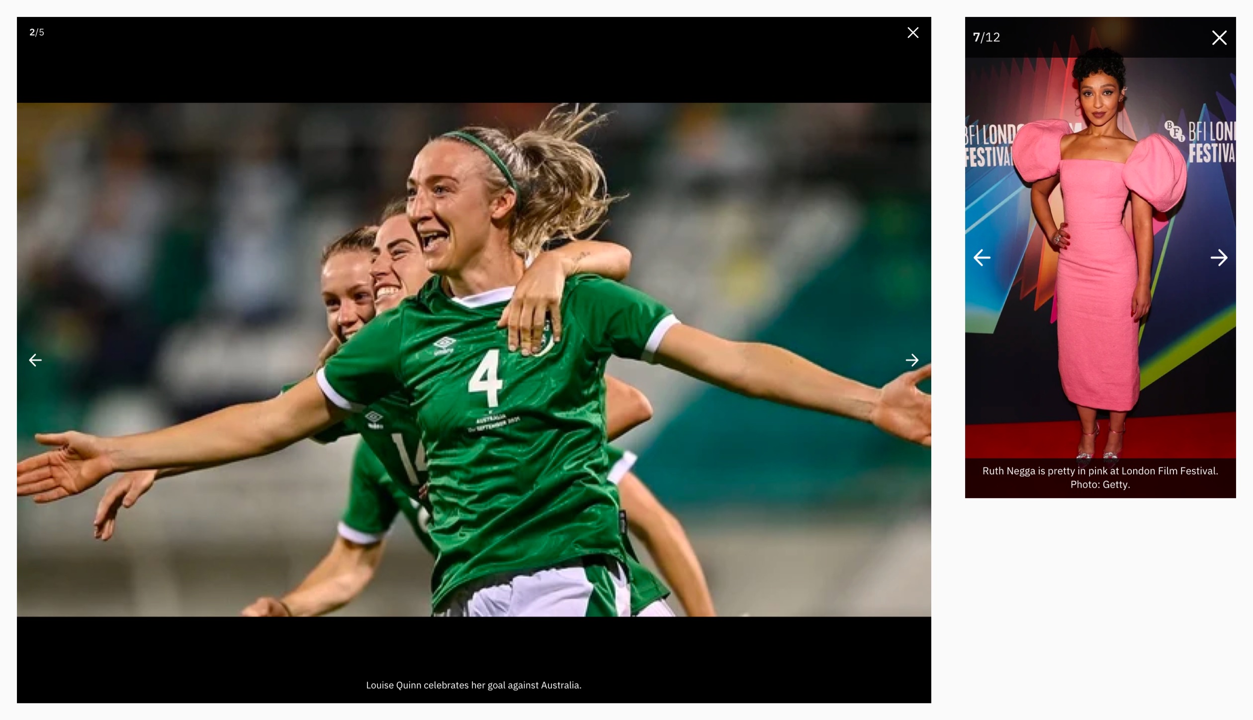
Desktop and mobile examples of a story image gallery
Audio Embeds and Pinned Audio
Audio can be easily embedded into the body of a story in the CMS. Audio embeds are styled to match the audio player panel on the RTÉ Radio site. If audio is the most important part of the story, editors can pin the audio to the top of the story in the place of the main image.
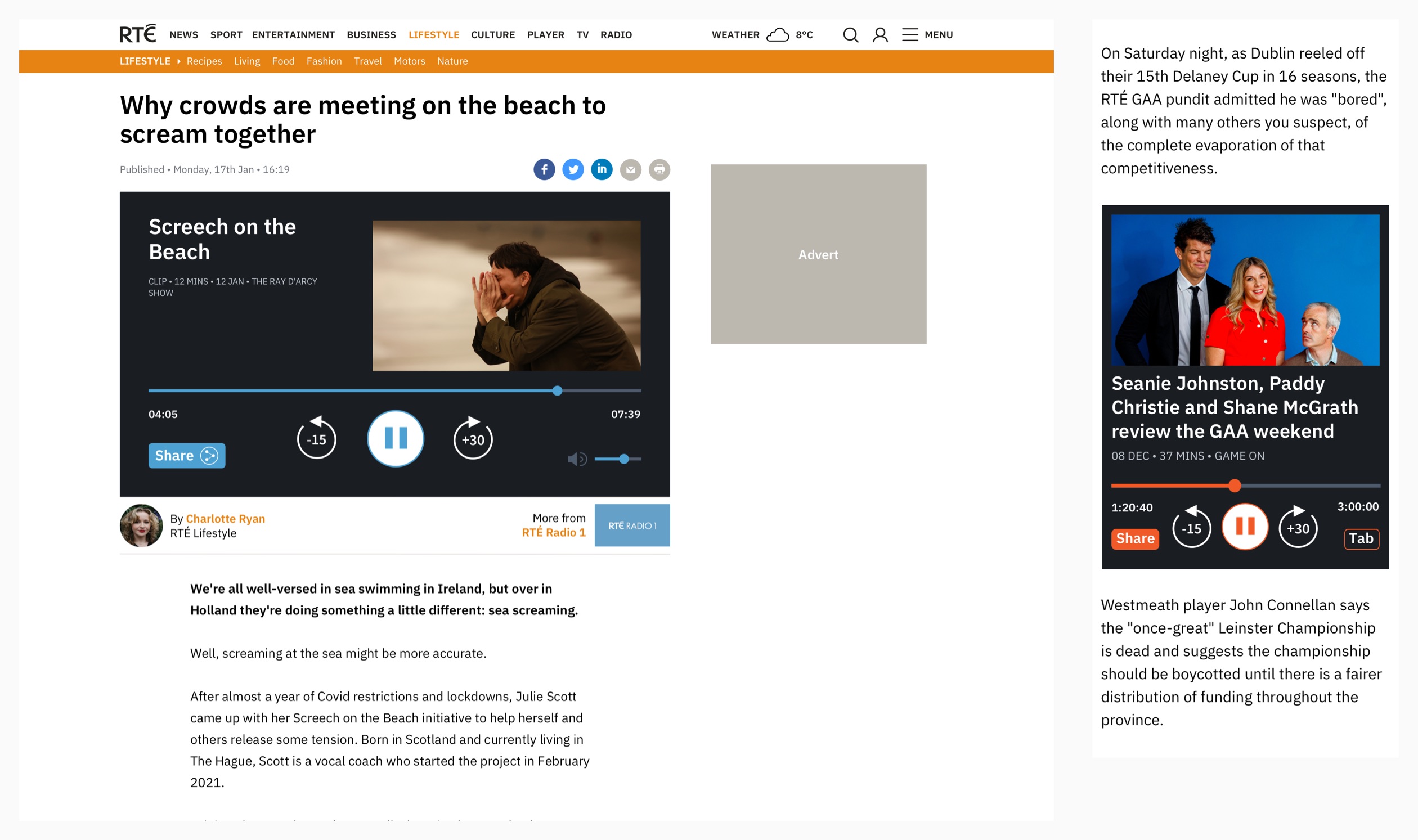
Examples of pinned audio player on desktop and audio embed on mobile
Story Pages Populated
Here is an example of an rte.ie story page showing image and text formatting, an audio embed and the above story panels.

Desktop and mobile examples of a sport story
Story Page Variants
Some story types require additional information or formatting and have specific templates in the CMS.
Recipes and Reviews
The recipe template displays ingredient list and method. The review template displays a star rating, age rating and other specific information for the item being reviewed.
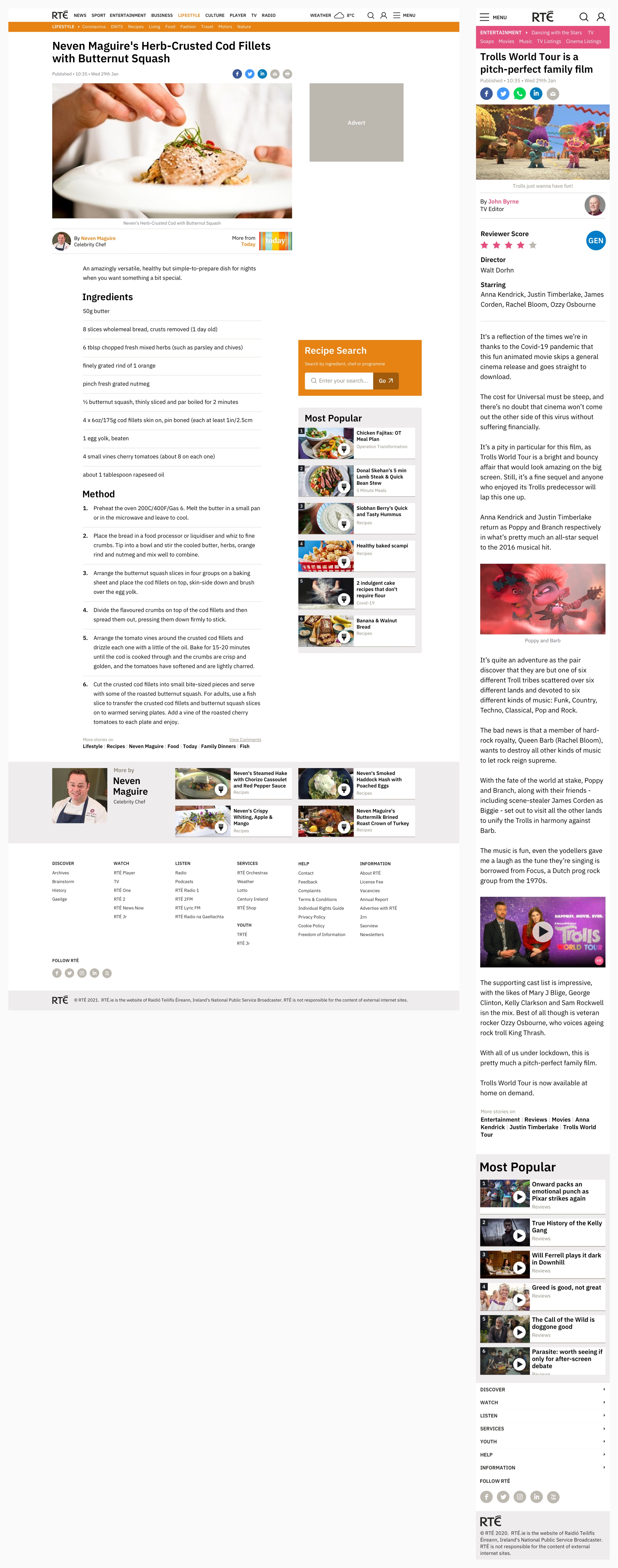
Desktop and mobile examples of recipe and review stories
Sponsored Stories
Sponsored stories also have specific styling to differentiate them from regular stories.
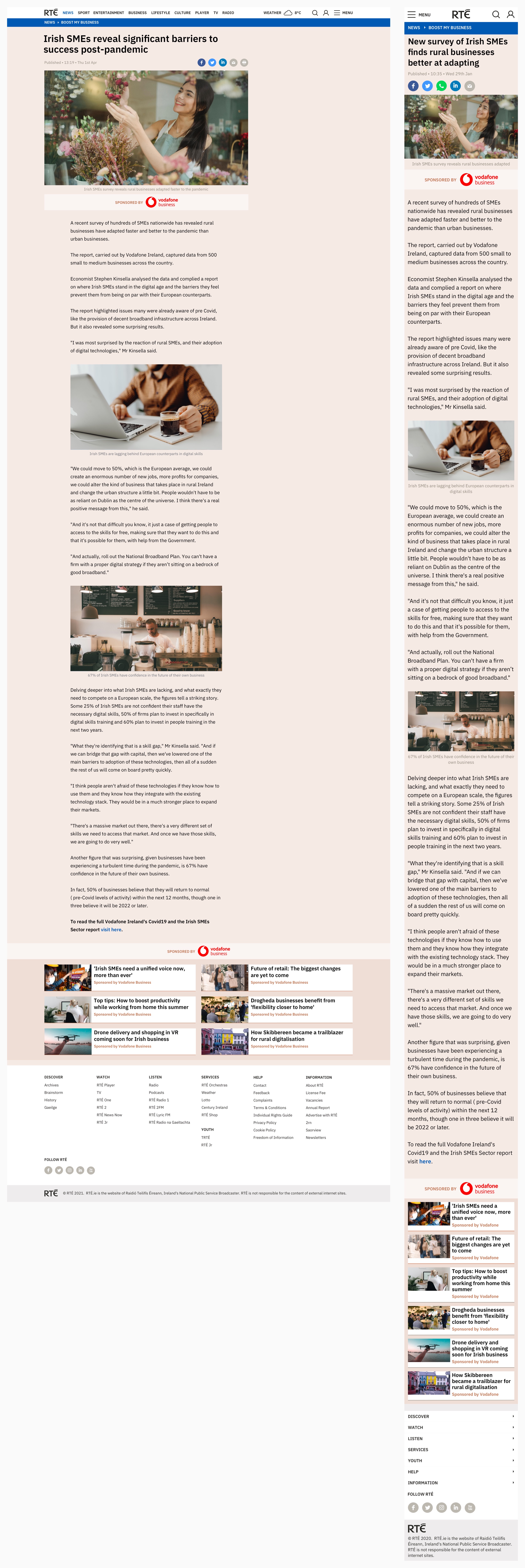
Desktop and mobile example of a sponsored story
Live Tracker
The Live Tracker template is used when editorial teams want to publish the latest updates on a live event as it happens. This is especially useful for live sport, elections, budgets, Covid briefings and other big news stories that tend to develop over time. Each update is called a post and the most recent posts appear at the top of the story. Highlights and links to supporting content can be displayed below the main image. New posts published while reading spawn a button to alert the user.
Desktop and mobile example of a Covid-19 live tracker
Timeline
The Timeline template allows editors to highlight key moments of an event or a person’s career. It uses the same post-based template in the CMS as the live tracker but posts are displayed in order and can be moved around in time.

Partial desktop and mobile example of a timeline
Long-Form
Every once in a while, a journalist writes a longer, feature story – many of which have a lot of great supporting photography and media. I worked with developers to create a modular, long-form story template that allows editors to build longer, visual, magazine-style stories by adding and re-arranging blocks with various different layouts in the CMS.
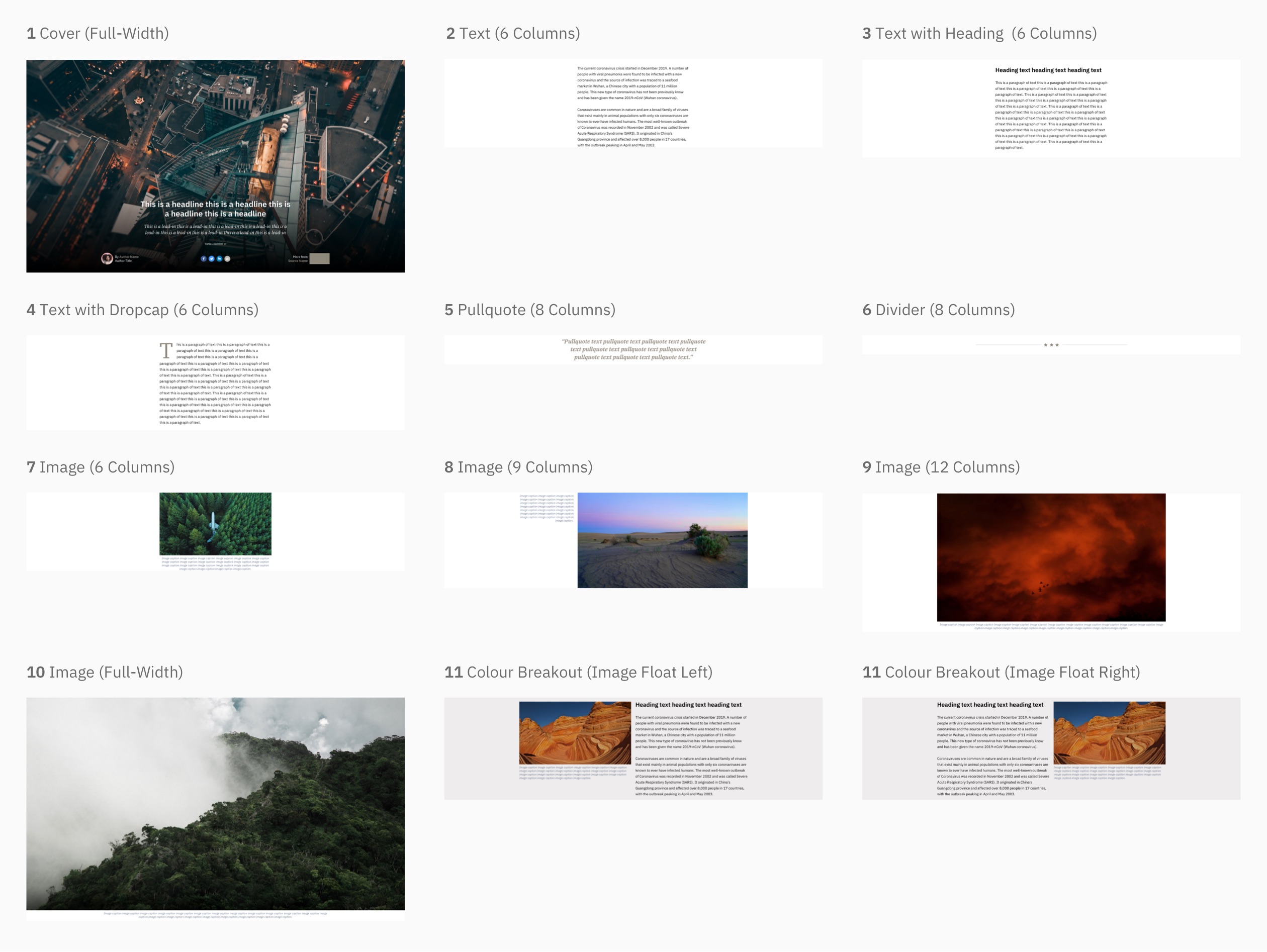
Various desktop block layouts available for creating a long-form story

A shortened example of a long-form story showing various blocks in use
Sport Results
RTÉ covers a range of sports and provides up-to-date listed schedule, results and tables for the major tournaments and competitions in GAA, Soccer, Rugby, Racing, Golf, Formula 1 and Tennis.
Each sport is divided into tabbed pages of fixtures/schedule, results and tables. These views vary depending on the sport, but the underlying style remains consistent. They are populated by data from external providers.
Most of the sport results views are based on four templates: link lists, fixture lists, results lists and tables.
Link List Panel
The link list panel is a simple list used to list sports, tournaments and other available options before seeing any in-depth detail.
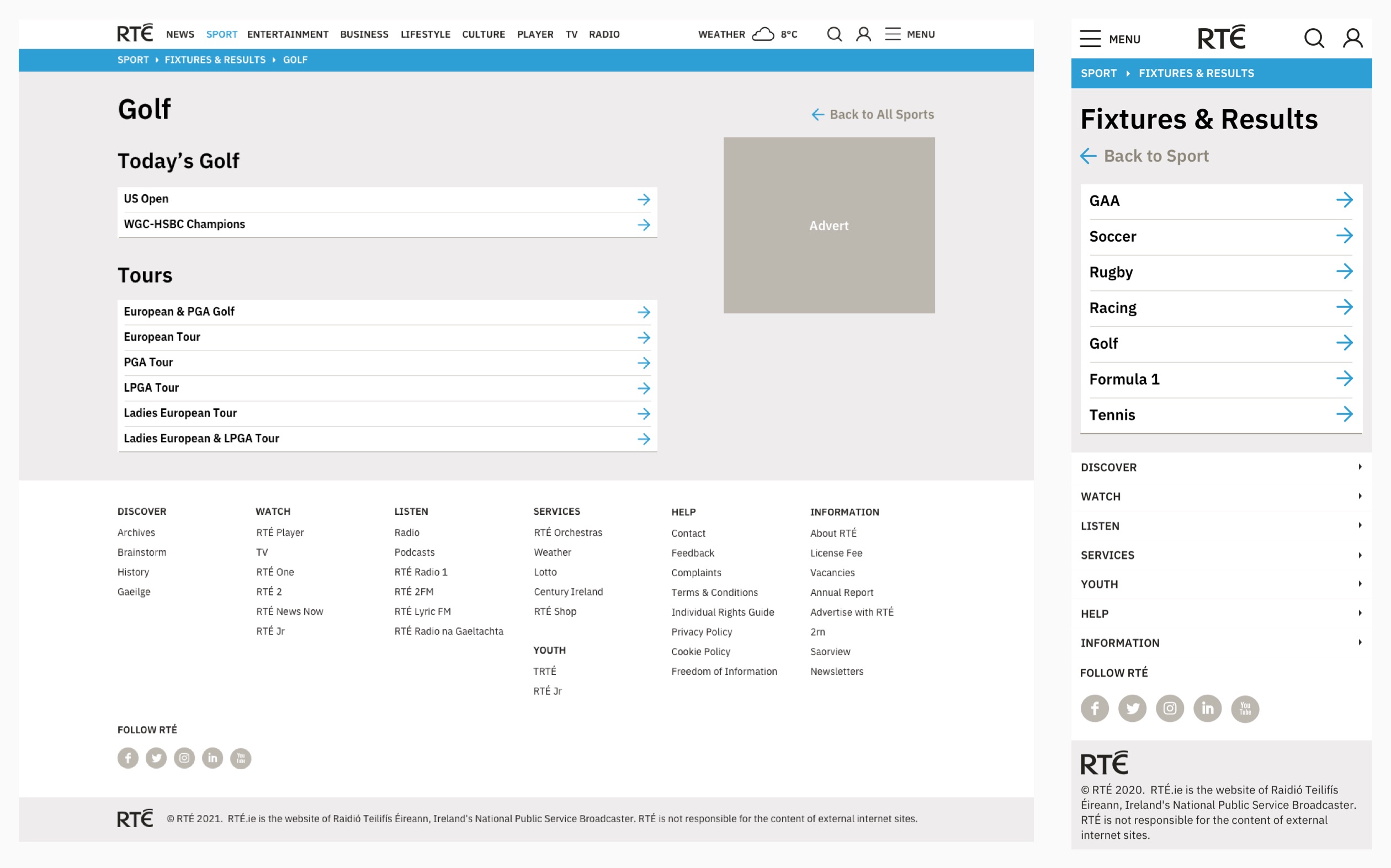
Desktop and mobile examples of the link list panel
Tab Components
Tab components allow users to quickly navigate between related sport results views using tabs with active and inactive states.

Examples of tab active and inactive states
Fixture and Result Tile Components
Fixture tiles show an upcoming event or match including the name of the event (or team names with their crests or flags), the time, date, competition stage and venue information. Result tiles show mostly the same information as the fixture tiles but with event status and result information in place of scheduled time.
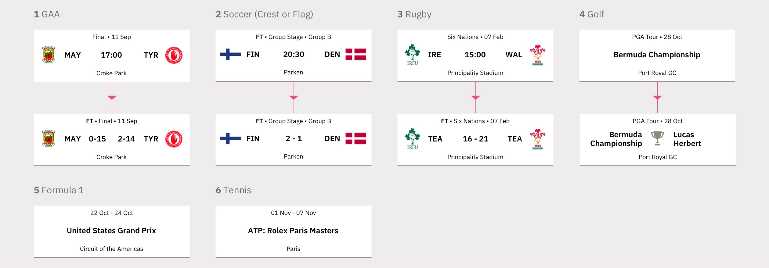
Examples of the fixture and result tile components on mobile
Fixture and Result List Panels
Fixture and result list panels display a list of fixture or result tile components. A pagination component is displayed on fixture or result lists with more than ten items. Fixtures are displayed by date forwards, results are displayed by date backwards.
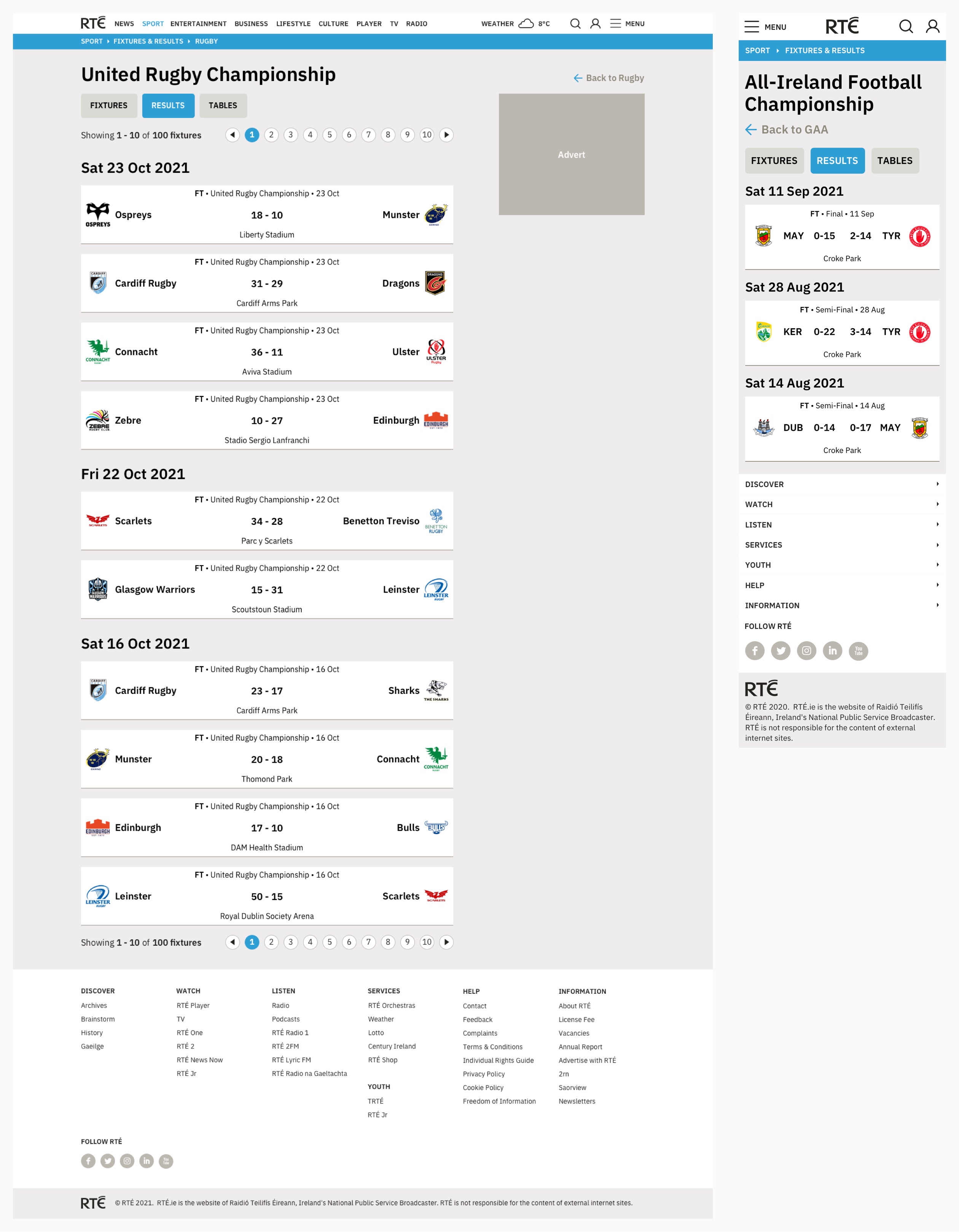
Desktop and mobile examples of the results list panel
Match Reports
Result tiles for rugby and soccer link to an in-depth match report showing a timeline of key match events (e.g. goals, cards), team line-ups, statistics (e.g. possession, corners) and standings table.
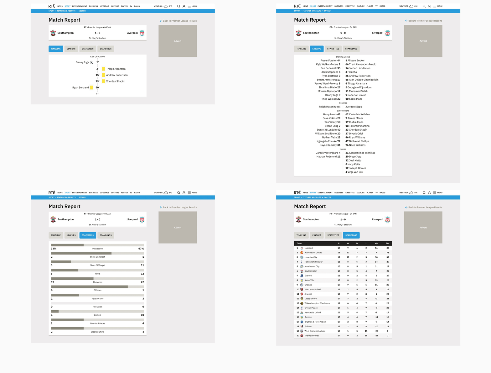
Desktop example of the four tabs of a soccer match report
Tables
Tables are used to display league tables, results, standings, earnings and match information, depending on the sport. While the tables are responsive, some less important columns are removed or abbreviated for mobile users to get the most out of limited space.
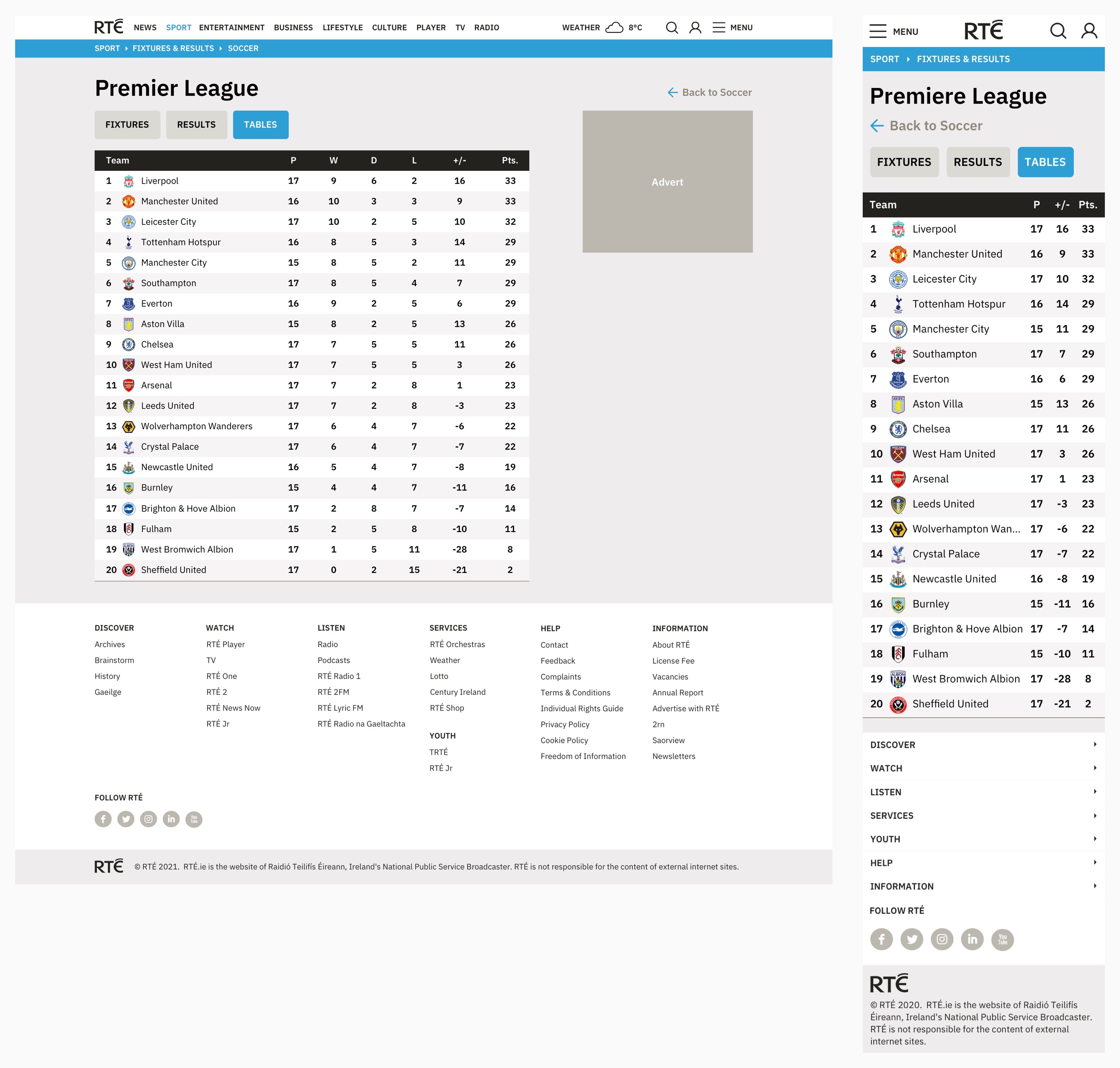
Desktop and mobile example of the Premier League team table
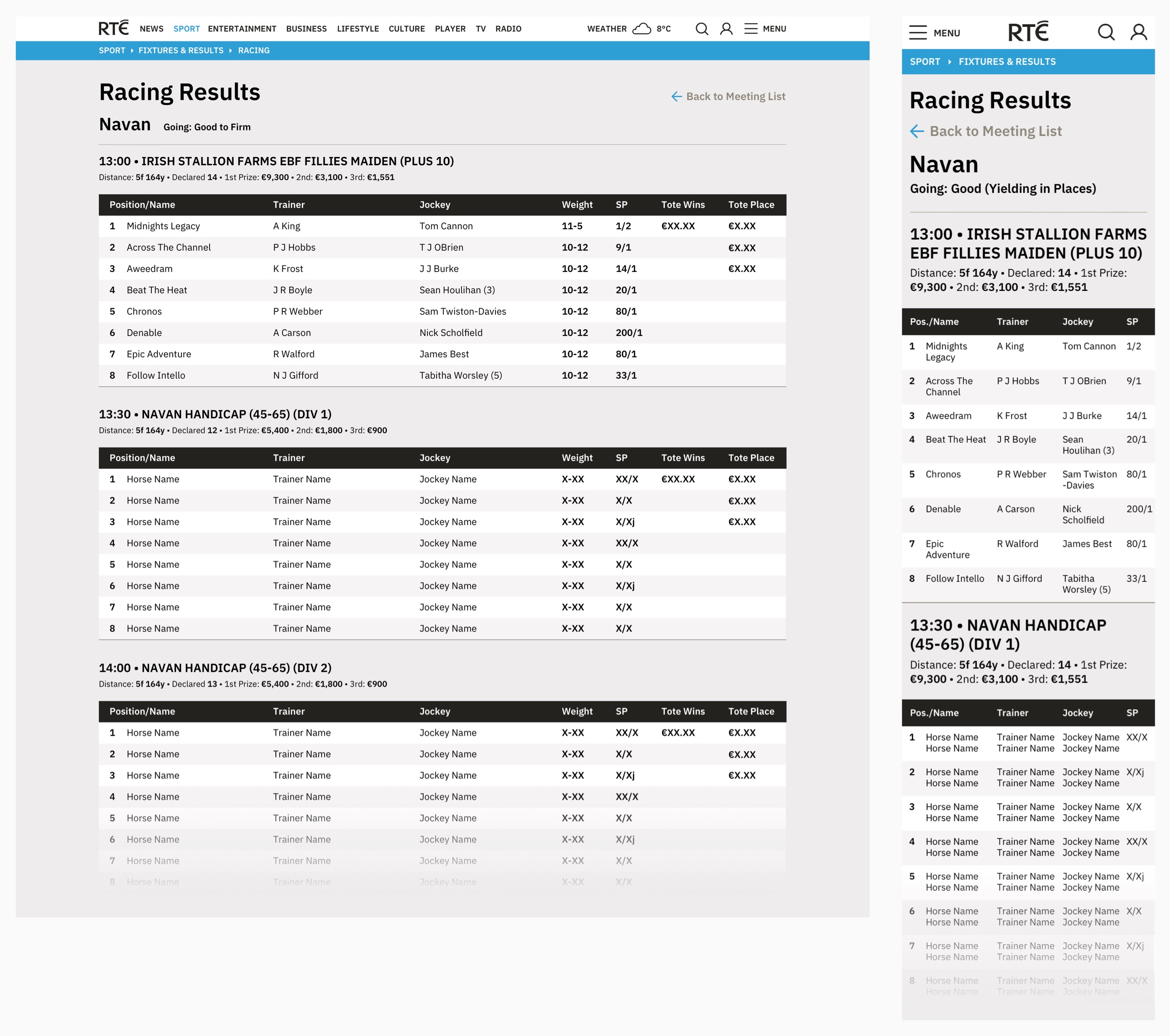
Desktop and mobile example of racing meet tables
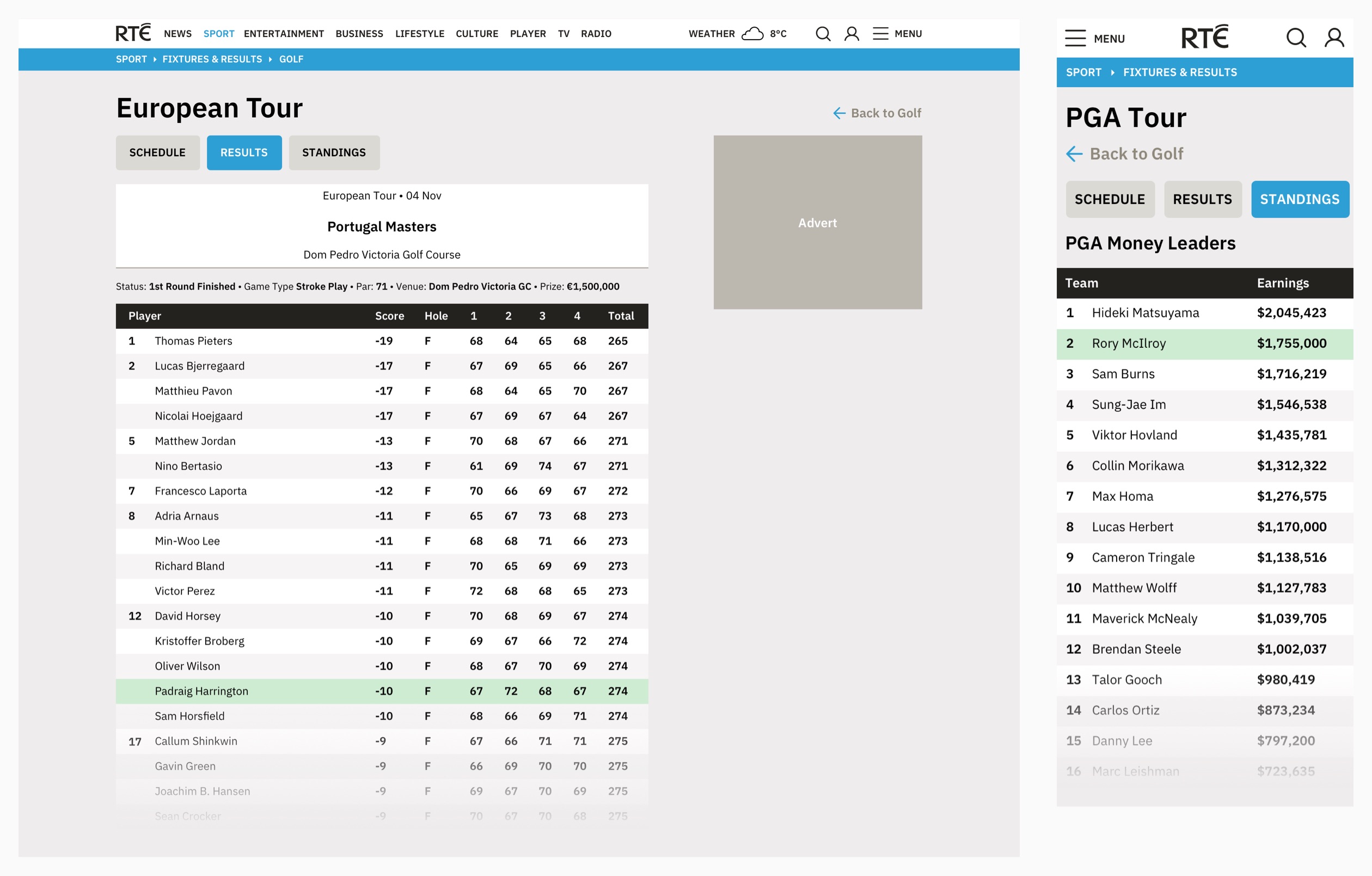
Desktop and mobile example of golf results and money leader tables
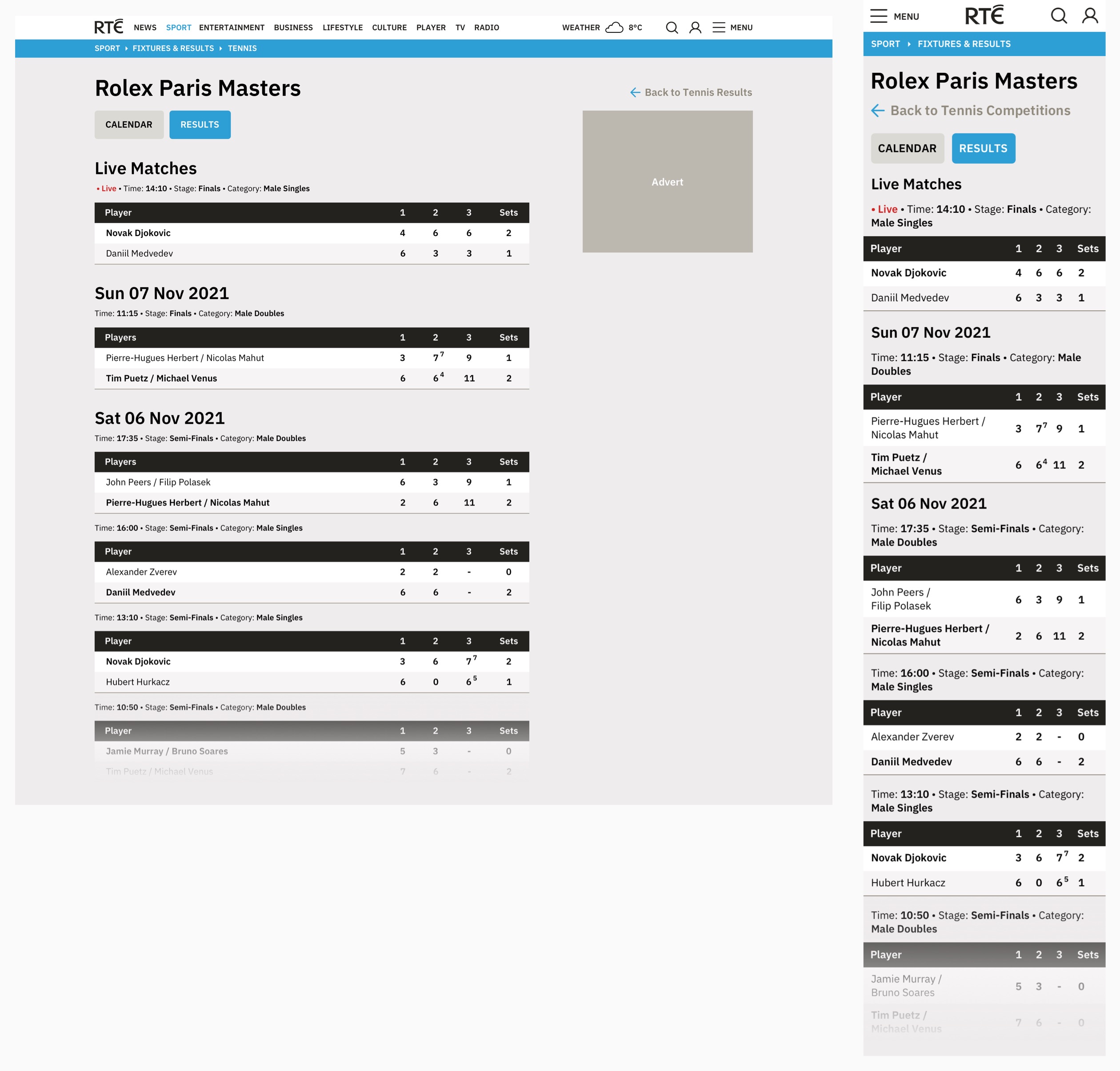
Desktop and mobile example of tennis results tables
The styling used on sport tables is also used for tables elsewhere on rte.ie e.g. TV and radio listings.
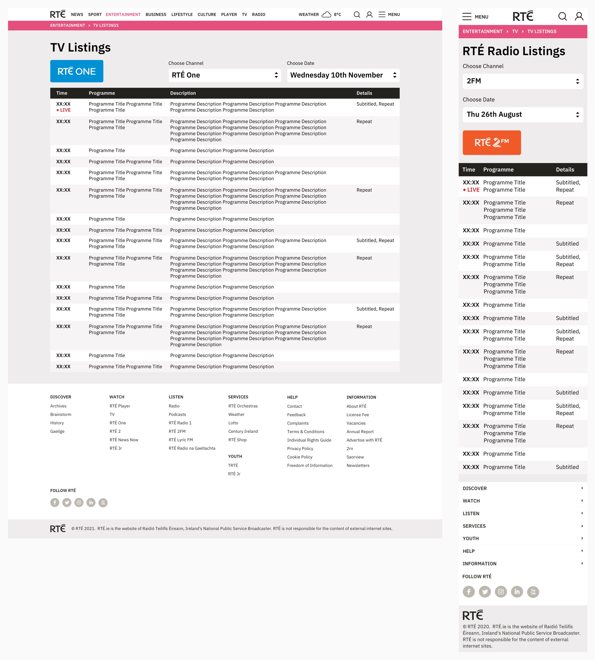
Desktop and mobile designs for TV and radio listings pages
Live Results Panel
Having a dedicated section for Sport fixtures and results makes sense, but we are always thinking about better integrating that data into other pages on rte.ie in meaningful ways. The Live Results panel allows editors to highlight current live result data for several matches being played at the same time. Each results tile links to a live tracker for that game.
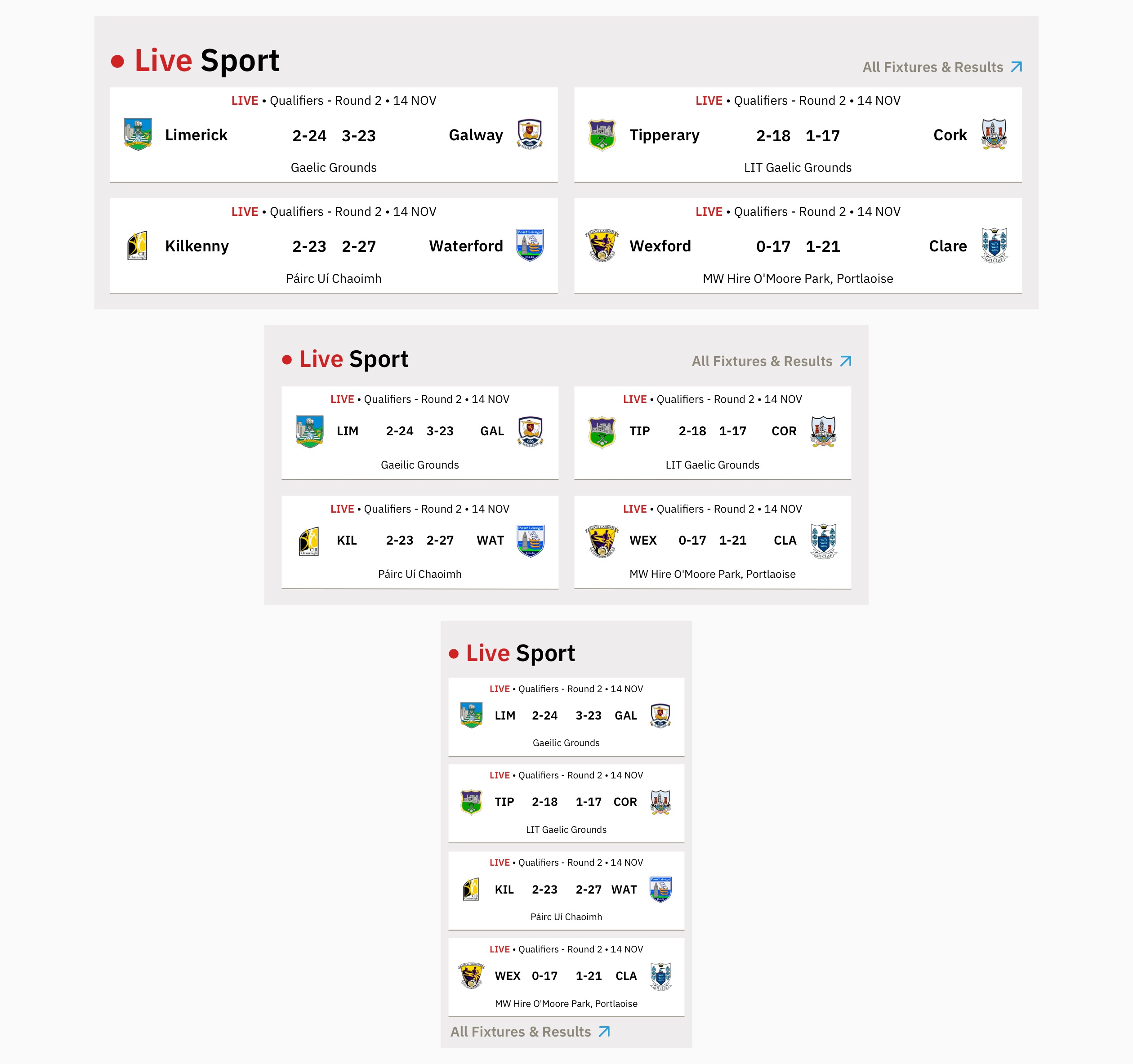
Responsive designs for the Live Results panel
Events on rte.ie
A few times each year, RTÉ’s editorial teams cover a large news or sport event and a dedicated site is designed and built.
Elections
The biggest news event in RTÉ is an election. RTÉ’s general election coverage is a varied and complex logistical project, broadcasting live, all-day TV and radio coverage and analysis of election results as well as displaying live online election result data on a national and constituency level. You can read a more in-depth RTÉ Election case study here.
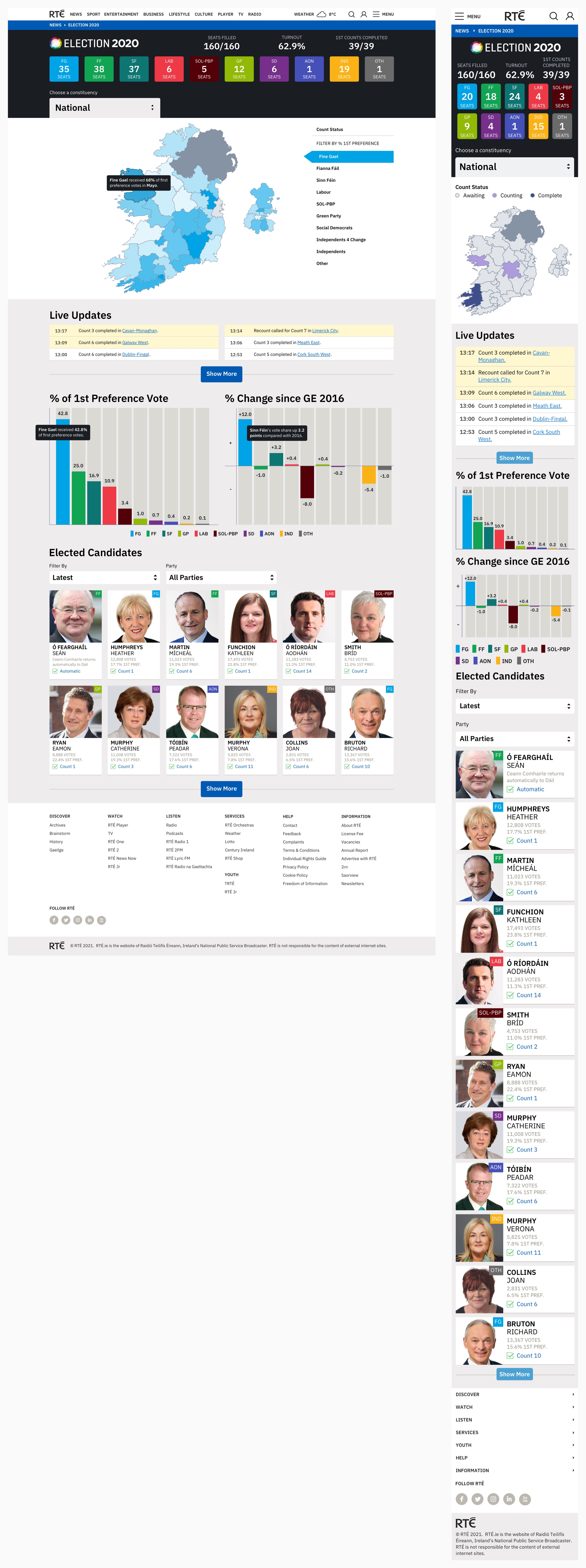
Desktop and mobile designs for the national results overview for General Election 2020
Sport Events
Large sporting events or competitions e.g. World Cup, European Championships, Olympics generally take place over a number of weeks, so branded indexes are designed and run for their duration. Editorial stories are blended with fixtures, results, group tables, stadium guides and more, depending on the data available. Some bespoke panels or variants of existing panels are usually created.

Desktop and mobile designs for the Euro 2020 index
What Next?
Hopefully this case study gives you a good idea of the structure of the rte.ie product design system, how editorial teams can use it to highlight and curate the best RTÉ content and how my design process works within the project team. I am always trying to improve my workflow because we are a small team so any time savers can make a big difference. We are moving to Figma as a UI design tool – using Figma’s components and variants, we will be able to create smaller, neater design library files. We are also looking at better pre-development user testing of our prototypes using Maze.
Feel free to visit rte.ie here to see the current iteration of the site.
